|
Color is hard. And nighttime color is even harder, because your options are seemingly more limited to cool colors. I'm going to talk about how I learned how to improve my color through nighttime scenes, and hopefully somebody can glean insight from it. 1.) Rookie Mistakes- Too many colors. 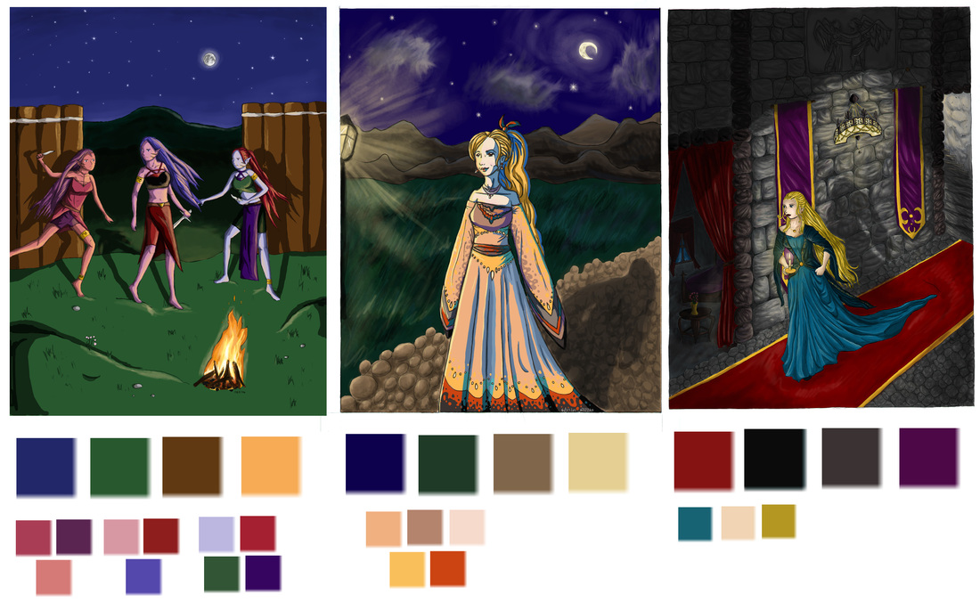 These pictures are SO OLD. Above are some of my really old paintings from about 10 years ago. You can see by the color samplings from the paintings, that I didn't really have any grasp on color except for a rudimentary understanding of local colors. There are too many colors, and they are too saturated for nighttime. It's important to have an idea of the overall color scheme, especially for nighttime because it is so limited. Usually nighttime colors are de-saturated and lean more towards cooler hues. 2.) Don't limit your palette too much. 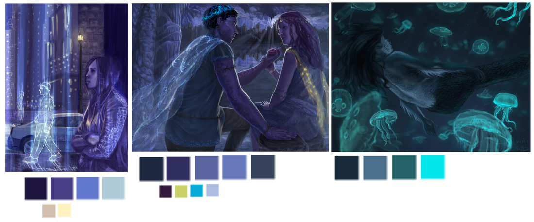 Here are some newer paintings, but still old. You can see that I finally understood that nighttime is blue. However, my palette was not very diverse, mostly shades of the same hue. It looks better, but it's important to try and introduce secondary colors to liven up the scene. Something else important is to pick the dominant hue that you want nighttime to be. You can almost get away with any color, as long as it is dark enough and the lighting is correct for night. The painting on the right of this set is newer than the others, you can tell because I introduced cyan into the mix, instead of the same shades of indigo that I would previously default to. 3.) Focus your color palette. 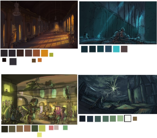 A few of these are color studies and not the final pieces, because your color should mostly be figured out in this stage. As you can see from the last set above, the color schemes are very different from one to the next. It's easy to begin by choosing your main color (i.e. cyan, indigo, purple) and then deciding on your accent colors. Accent colors can be from a specific light source, or small smudges of hues to complement the main color. You can see how I did this in the right two paintings. On the top right, I put a red light on the front statue, although the color appears more brown when sampled by itself. And on the bottom right I put a small bit of orange on the front rooftops. If you're having trouble with colors, look up famous artist's paintings, or an artist you admire and try to recreate that color scheme yourself.
0 Comments
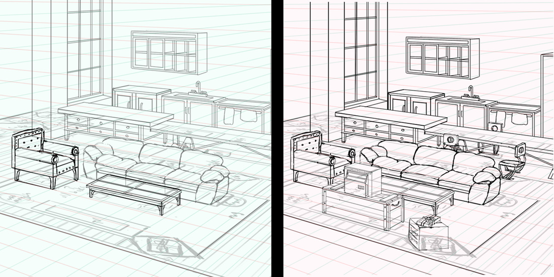
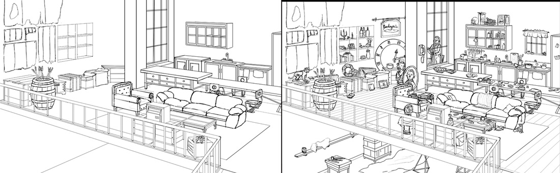
As part of my Revolution project, I wanted to draw a French street depicted in the novel. As this was an intensive scene, and my first crowd scene that I had painted, it required a lot of prep work. First I went to the book and jotted down notes on how the author had described the location. 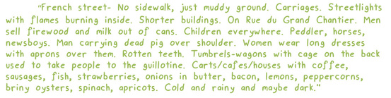 Since the scene took place in 1795 Paris, I really had no idea what the make-up of the architecture would look like. First I googled “Rue du Grand Chantier”, the street name. I found out that it was an old street that had been renamed, and probably completely rebuilt by modern day. But the article referred to which modern day section the street was now and included coordinates for it. Luckily for me, Google Street View existed of those coordinates and I was able to get a brief idea at what the make-up of the street might have been. 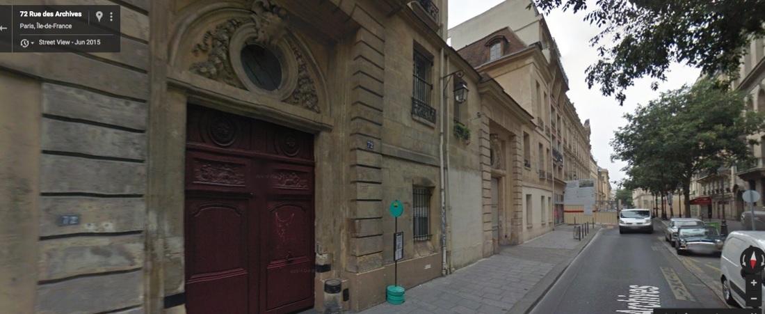 Check out the street view by clicking on this picture. After this point, I gathered together some of the paintings I had of the time, and I looked at some of the production stills from Assassin’s Creed: Unity, as that video game took place during the French Revolution. Seeing how other artists had depicted streets at the time helped me formulate my own ideas. Unluckily for me, at the time period that I needed reference paintings from, artists were not yet interested in painting realism, or depicting the middle and lower classes. A lot of my picture would have to be designed on small amounts of fact. 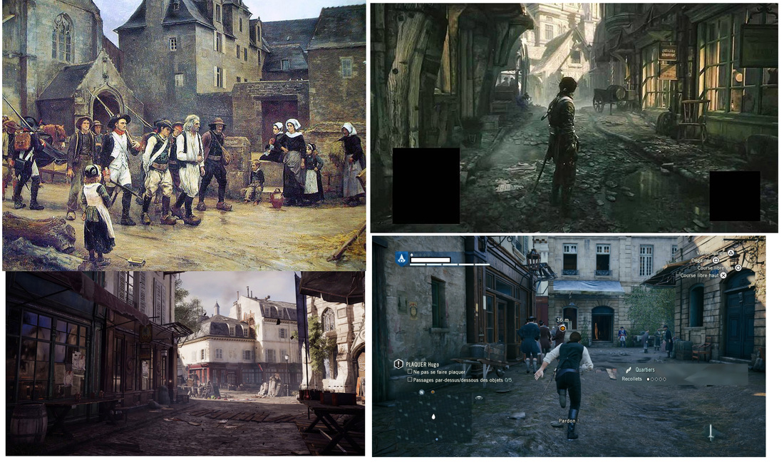 Next, I began to thumbnail. It was hard to get the composition I needed, as I wanted to show a large part of the environment, while also showcasing a lot of people. Although my thumbnails are very rough, and perhaps unreadable to other people, they helped me immensely. 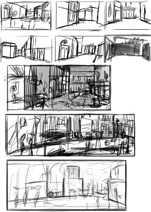 Once I decided my composition, I set up my perspective grid and drew out the environment, before drawing any of the people. After this, I sketched out what I wanted the positioning of the people, and then I drew the people. 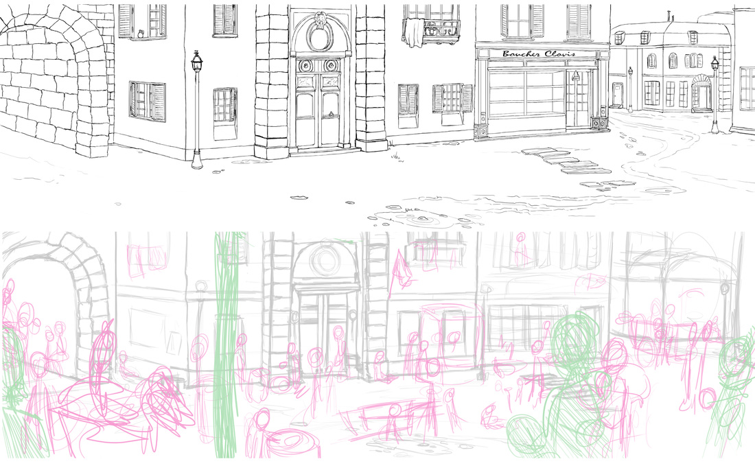 I had some reference for clothing, which I obtained from paintings and from my local library. Clothing changed so drastically from pre-revolution to the revolution that was hard to find enough reference for the few years I needed. The key is to look at a lot of sources so that you get enough variety. 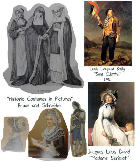 I forgot to jot down the name of the book for the images in the bottom left. Back to the library to check! After I cleaned up the line art for the characters, I did several color studies. I have been learning about limiting my color schemes, so I tried to experiment with that in the studies and the final color. If you are having a hard time thinking of color, look at other people's paintings and paint a study with their colors. Avoid the eyedropper to train your eye to better see color. 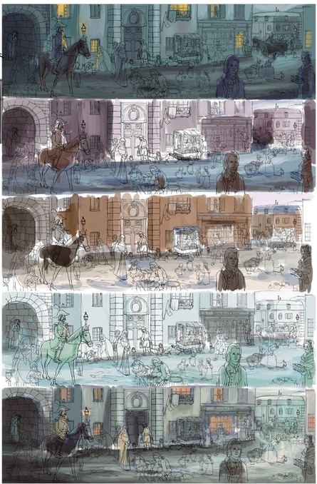 After blocking rough color, I colored all the people, as they were rendered differently from the background. After the people were done, I finished painting the background. 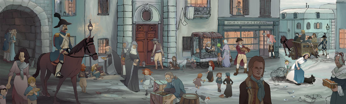 Finished people. 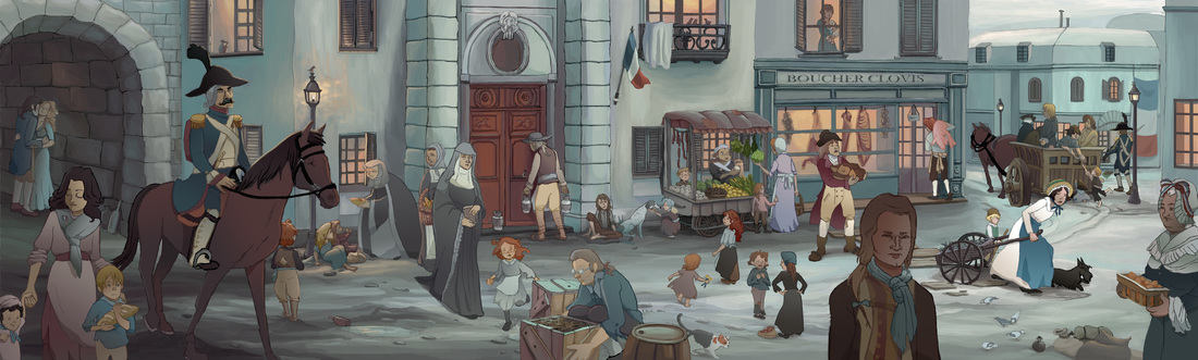 Painted background. At this point, I make any final adjustments to color and add atmosphere and small touches of additional rim lighting or bounced light to make sure all the characters stood out, or did not distract from one another. Specifically, I added some blue atmosphere to the background right portion so that the people being taken away in the cart moved back in space, I added some more shadow to the tunnel, and some glows to the light sources. 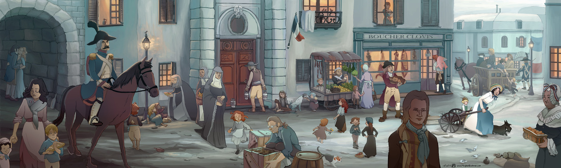 After I completed the painting, I realized that nuns were persecuted during the Revolution, so they might not actually have appeared in this scene. But no one would pick up on that, unless I wrote about it in a blog post. Hmmm...
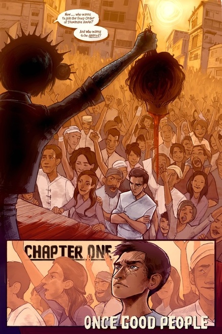
 Concept art for Andrew Adams and Rachael Briner's kickstarter for "Schismatic". Since I have never Kickstarted anything before, I interviewed 4 friends who created and funded 3 different projects on Kickstarter.
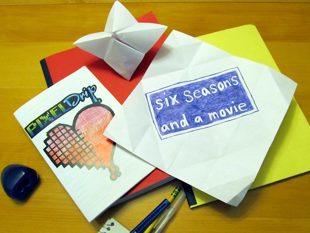
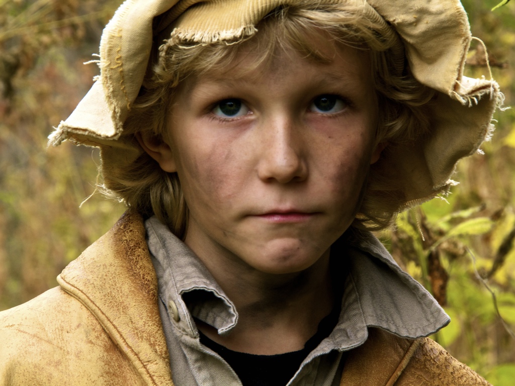
1.) What was your Kickstarter?Andrew and Rachael: We ran a Kickstarter to fund the remaining five issues for a six issue comic mini-series called Schismatic. We raised 108% of our goal. We asked for $12,000. All of that money went toward page rates. Evan: Three years ago I was part of the "Six Seasons and a Movie" Community Art Show Kickstarter, curated by PixelDrip Gallery. When the NBC cult sitcom Community ended its third season and it looked like it was fated to never return, we at PixelDrip felt obliged to hold a fan-art show as a tribute. Fans of the show must have felt the same way, because we got funded nearly 200% from our initial goal of $3500! Matthew: My Kickstarter was for a "western" short film called Restitution. It involved a lot of moving parts such as stunts, horses and animal handlers, difficult locations for equipment trucks to navigate, and a variety of other variables. I wanted to be sure that I had enough capital to ensure success for such an ambitious project for a 21 year old. 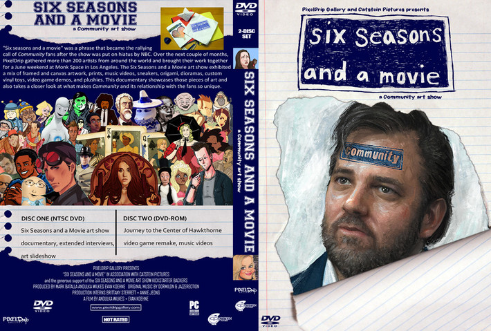 From Evan's Kickstarter. 2.) What are your tips and tricks for getting funded? Andrew and Rachael: (Andrew) Ask people for money directly, and personally. I was stunned to see who came out in support -- like old high school contacts who I was friendly with but not close to -- and they only did it after I sent a personal e-mail. Blanketing my social media feeds with requests wasn't enough, because it's impersonal. So ask directly. A site like www.greeninbox.com can send out mass e-mails, and make the "direct/personal ask" very fast (if you can make it seem like it's not a form letter). Also: Ask Bleeding Cool to let you write an article for them, and they'll feature you to a big community. Make a good video, and show your art. Add 'Kickstarter Exclusive' rewards -- they're attractive. $25 is a very common pledge -- put your key reward at $25. We made our exclusive reward at $50, and that also worked. Make sure that you have some high (but reasonable) rewards, in case anyone's feeling friendly. Build buzz in advance by letting everybody know that you're working on a project, and sharing updates. We also gave out our first issue before the campaign closed, and we had a lot of people increase their pledge to read the rest. Not a ton, but enough. And only one person took the first issue and cancelled their $5 pledge, so ultimately it earned us far more money than it lost. (Rachael) First, do a lot of research. Find out how much money past successful Kickstarters in your category typically raise, and find places and higher up people to send your Kickstarter to once it launches in order to gain exposure; or do what I did and find someone to partner with who knows about networking and marketing (yo yo Andrew Adams). The first week or two will mostly be just from friends and family. And while there is usually a big push at the last week, being able to get your work seen by strangers is what will help you reach your goal Another important factor is to offer your donors something they won’t be able to get after the Kickstarter. Our rewards that really got a lot of attention were the tiers where you could be drawn into the comic. These sold out very quickly and, I feel, really made the donors feel like they were getting their money’s worth and were also getting a special experience that will never be available again in this story. Evan: While every Kickstarter campaign is going to be different, there are a few tips and tricks I've noticed that can help one get funded. First, update your Kickstarter frequently; daily, if not twice daily. People who are giving you money want to feel like you are taking your project seriously. It is also helpful to have gifts that someone would want, but also gifts that are realistic for you to produce. Don't offer a hand-made doll to your $5 funders... Save the really sweet perks for the people that give you triple digits. It is also extremely helpful to be making a project with some built-in fan recognition, or to already have built a strong reputation for your own work if you are trying to fund a personal project. When we started out Kickstarter, PixelDrip was relatively unknown, but the show Community had a huge underground fan base. They saw something they wanted that we were providing, and they jumped on the opportunity to make the fan-art show a reality. Funding personal projects is always harder, but if you spend the time to make good artwork and spread it across social media, it will go a long way towards building your fan base and your reputation for when you are ready to make that film or comic book or solar-generated Rumba. Matthew: Most of my donations came from people I knew, or people that who were friends of people that I know. I would usually have to call people up as some donors just don't do anything unless they are poked... Donating $25 to someone isn't really on a lot of peoples' high priority list due to day-to-day events that push it to the back burner. I used social media, but really I needed a larger following to begin with before I could rely on that. Expecting donations because your project is "cool" or "unique" doesn't really make sense. There are plenty of great projects around, so unless yours is the 1 in a million, you need to treat it as a part time job. 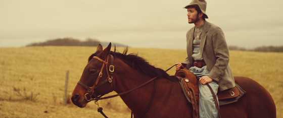 A still from Restitution. 3.) What was the hardest part? Andrew and Rachael: (Andrew) Asking people for money. It sucks on your end, but ultimately you're talking to somebody who loves you and wants to support you and doesn't mind you asking at all, so just do it. Or: they won't donate, but whatever, they don't care that you asked. So just do it. (Rachael) Managing e-mails and contacts. I was overwhelmed by the amount of people I had to reach out and respond to, and I barely got any compared to my poor partner! Having a Kickstarter is essentially another full time job; I don’t recommend doing it alone. And the awful two week lull that happens in the middle of the funding. Suddenly you go from getting $1000 a day to $50, if that. Evan: The hardest part was staying on budget and fulfilling the donation gifts. What you are very concerned about when you start a Kickstarter is how much money you will need to pull off your project. What you forget about is the hidden cost of producing and mailing all of your promised gifts to your funders. We spent almost 3 months after the show was over getting the gifts together and shipping them out. It was a good thing we made twice our goal, because we used it all to produce and mail our gifts. Whatever you think your project will cost, double it. In fact, triple it. You may be weary about asking for that much money from people, but it is far better to have a reasonable budget that fails than to be funded and not end up having enough money to complete your work. Matthew: The hardest part for me was the back-end shipping. Out of necessity I had to move on to other work as I freelance full time, and not planning a transition period between my project and work was horrible. Many long nights trying to get everything ready and many early mornings not feeling rested because making prizes (depending on what they are) simply takes time. It needs to be accounted for.
4.) What would you do differently next time? Andrew and Rachael: : I think our campaign would have been more successful if we'd found a way to add print rewards. I don't know how that's possible, given what we requested, but I think it would have netted more backers. And I'd be curious to try a shorter campaign. The middle weeks were a slog -- you'd go up 1% or 2% a day -- and it seemed like only the first 3-4 and last 3-4 days really made an impact. I'm curious if a shorter campaign would encourage energy/momentum or not. Who knows! Evan: The next time I do a Kickstarter I want to try doing a personal project. It is far more difficult than doing a project with a built-in fan-base but with a little can-do attitude doesn't seem impossible. I would absolutely not be afraid to start a video blog and update every day. I would also urge everyone doing a Kickstarter to be open and transparent about what the money is going towards, even if it’s late-night meals to help you stay alive while you print postage stamps for your three-hundredth funder gift. More often than not, you'll be pleasantly surprised at how generous people will be if you are straight-forward and honest with them. Matthew: I think that the most important thing that I learned (and subsequently would do differently) is how to value what I was creating and what my time was worth. I found very quickly that the money that I did get was after a lot of work (felt like a part time job) and then I had to create/ship prizes to my backers after completion, which was extremely difficult as I needed to switch gears into freelancing just to survive. Understanding a better number of how much capital to ask for, and also planning a lot more in depth as to when and how I would set aside time for the back-end of the process is absolutely crucial. Making time to plan the kickstarter is Key, and that is not necessarily easy to do when regular life gets in the way.
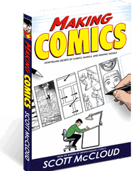
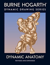
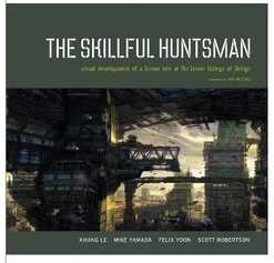
Finding art reference, whether it be in the form of a concept art book, a how-to book, a website or the artists of antiquity, is incredibly important to keep your craft up to stuff and keep you always learning. After a friend of mine inquired about which references I find most useful, I thought I would write about it here: BOOKS
Art books of movies are great resources too, some of my favorites include The Art of Brave, The Art and Making of Cloudy with a Chance of Meatballs, and the art of any Miyazaki movie. Art history books are also great, and often glanced over. My favorite painters are J.M.W. Turner, James Abbott McNeill Whistler, Henri Matisse, Gustav Klimt, Norman Rockwell, and Jacques-Louis David. WEBSITES-Feng Zhu Design: Feng Zhu is an accomplished entertainment designer. His website is chock full of gorgeous art, and he offers a lot of video tutorials for free that he makes to teach people his process. -CGSociety: A good resource for looking at art, talking to other artists on forums and keeping up to date on CG news. Although the culture of the website has gotten a bit exclusive in the last few years, I still check back every once and a while. Their work in progress forums are particularly helpful. -Mayang Textures: I use this website all the time for finding high-quality photo textures for free. TUMBLR Tumblr is a dangerous beast. Inside a chaotic mix of teenagers being melodramatic, and many wonderful pictures of animals, you can find a great artist community. If you tailor the people you follow to only the best artists, you can log on each day to find a feed full of fantastic art and inspiration. That being said, here are links to some of my favorite artists on there: http://nicholaskole.tumblr.com/ http://shoomlah.tumblr.com/ http://blog.loish.net/ http://www.annacattish.com/ http://nesskain.tumblr.com/ http://pascalcampion.tumblr.com/ http://peahart.tumblr.com/ http://alexandrediboine.tumblr.com/ http://cranesketch.tumblr.com/ I hope these references prove useful! Feel free to comment with your favorite resources.
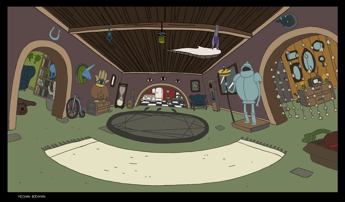
A few weeks ago, a friend of mine, Yuya Takeda, asked me if I wanted to help him with an experiment and paint a Virtual Reality background in 2D. I painted the first background as a simple interior for the proof of concept test. Check out what we made below! It was easy when it was just line art, but the instant I went to paint it, it became difficult. Trying to get the seams to correctly match up so that a realistic 360° view was presented, was hard. You don't realize how messy a painting is until you try to stitch it seamlessly to another. If you are viewing this post on Google Chrome (it also works on Firefox or the Youtube App), check out an interactive version of our scene here: Use your mouse to click and rotate the scene! This is the first test of many, next we'll be trying more complex scenes, perhaps a forest next!
As a follow-up to my time management blog, I wanted to expand on how I balance professional and personal art in my own life. Right now I work mostly from home. I still get large freelance assignments so finding a balance was big for me. 1.) Set clear boundaries for when you do and don't work on professional assignments. (If you can). I'm lucky enough where I don't have massive amounts of work so I can set my schedule and stick to it. I work on my freelance work during the week only until 5pm, and then on weekends and after 5pm I work on my personal work. It's important for me not to blur those lines, or I can get burnt out really fast, especially because working from home there is no leaving the work place at the end of the day. My schedule helps me feel more motivated to do job work too. 2.) Detach yourself from the internet. Sometimes at the end of a long day of working for someone else, the last thing you want to do is more art. If you really want to get your own work done, try turning off the internet, turning off the TV and putting on noise cancelling headphones to get in the zone. Music helps to keep me inspired to continue working. 3.) Consider having 1 or 2 larger personal projects, instead of many small ones. Last summer, I was just making one picture at a time. But I found that it was hard to get motivated after finishing each one, and hard to come up with new ideas every time that I liked. What I'm doing right now is a large design project. I read this book called "Revolution", about a modern day girl who reads a diary about a girl from the French Revolution. In order to give a focus to my portfolio and skill building, I decided to design all (or most) of the environments and characters described in the books. I spent a lot of time researching reference pictures, going to the library, and combing through the book to write down all of the author's descriptions for what I wanted to draw. I've found that since it's something I enjoy, and it gives me a large amount of small goals to reach, it's easier to get motivated to work on it. This way if I have a really busy week, I can just color a character sheet, or sketch an 18th century hat. I'm still working and contributing to an ultimate goal, but I don't have to spend all that creative energy trying to come up with a project every time. So finding something that gives a focus to your personal work, may make it easier to set aside time. 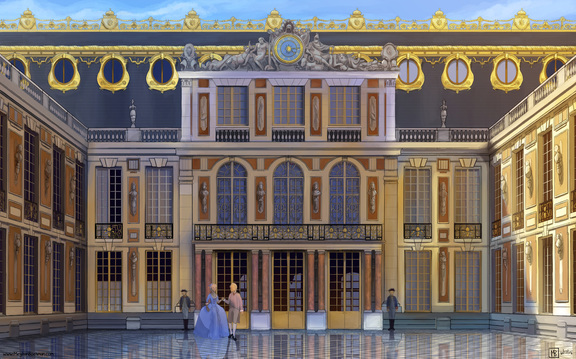 One of my paintings from my personal project. Time Management is a tricky beast. While it can appear to be something you are “just good at” or “just bad at”, ultimately it is a skill that takes time to learn and develop. You need time to learn how to handle time.  Here I am petting a goat with all my extra time! Why time management is important in the art industry. |


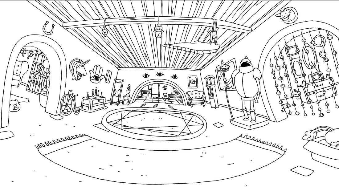 My final interior background for the test. | 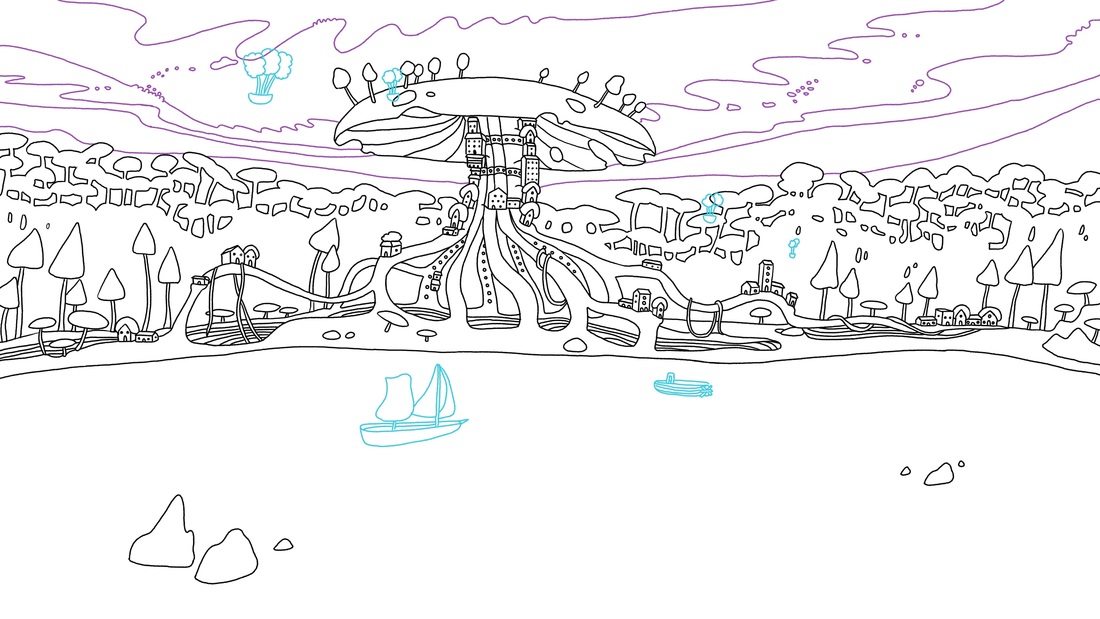 My final exterior background for the test. |
You have to work fast!
In any job, speed and efficiency are key. This is something that school doesn't really teach you. Whether you are given a test, or maybe a small free lance job, you quickly realize you are getting a baptism by fire. I thought I worked fast in college, but I didn't know how slow I really was. The key is to minimize the time when your pen is lifted from the tablet and you are staring off into space. Turn off that TV! Close out of Netflix! Log out of Facebook or Tumblr! Silence that cell-phone! If you find you work too slowly, take out these distractions and really try to learn how to be faster. It's not something that just happens, you have to work at it, really, really hard.
What happens after the test?
You wait! Many times, studios will already have an artist in mind when they post a job or a test, but they are legally required to advertise it, and interview or test other candidates. So, does this mean you can be asked to do a test and from the start someone else was always going to get it? Yes. Does it suck? Yes. Can you do anything to change that? No. Ok, ok, tell you something positive? Getting a test is still a really good sign. Studios will not waste your time. If they ask you to test, they are interested in your work. Also, many times studios refer to past tests when new positions come up. So, the test could be a tiny foot in the door. EDIT: Always make sure you get permission from the studio before putting your test up online.
Always ask for feedback!
A few weeks after the deadline had passed, and I was sure that I had not gotten the job, I emailed and asked for feedback on my test. I never actually heard back, but the important thing is that I asked. Definitely, do not pester. If someone hasn't responded, send a follow up email within several weeks only if the matter is very important. But after that, just let it go. If the person you tested for didn't respond, find someone else who is experienced enough to give you a good critique. If you know what to improve on, then it doesn't matter if you didn't get the job, because you have gained invaluable experience and knowledge with which to move forward from.
My final interior for the test, colored after the fact for fun.
As a side note, I'm currently a free lance environment designer on the animated series "Superbook" produced by the Christian Broadcast Network. I'm learning more now than I did in 4 years of art school! But, more on that in a future post. :)
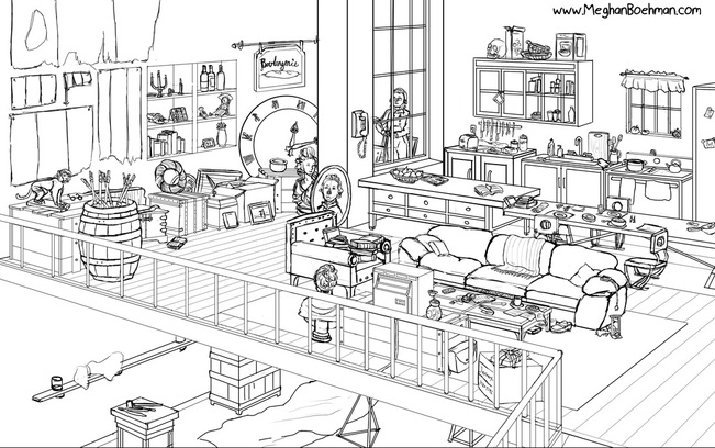
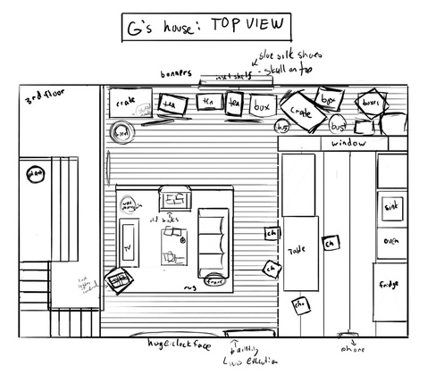
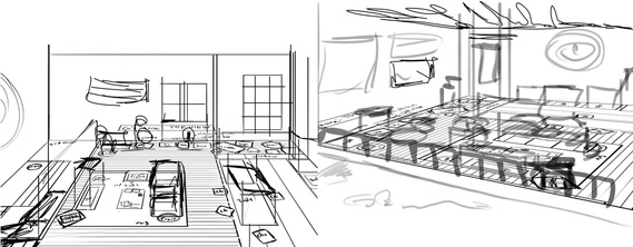
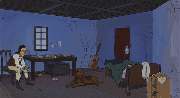
| I started a new project! I'll expand more on it in a future blog post, but the shorthand is I read a book called Revolution by Jennifer Donnelly. The book centers around a modern day American girl and a girl living during the French Revolution. I was so enamored of it that I decided to undertake a big design project to visualize the characters and the environments in the book. This picture is of the character Amadé Malherbeau's house. In order to breakdown my process even more, for this entry I'm focusing solely on color studies. First I start with a finished line drawing. | 
My crappy preliminary sketch. Rough sketches do not have to be beautiful to serve their purpose.
|
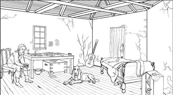
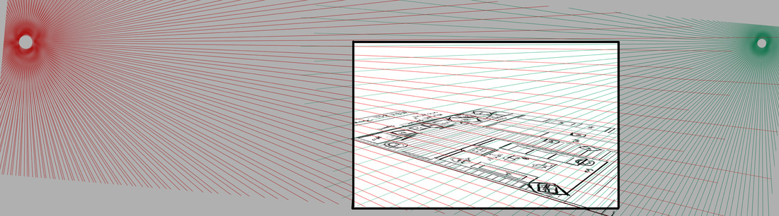
My line drawing is usually as close to final as I can get, with only a few construction lines remaining. It's important to fully visualize this before entering the coloring stage.
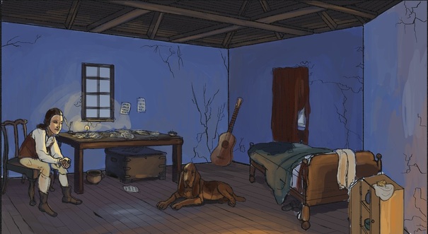
After I finish the line drawing (expect a future blog post discussing my process for draftsmanship), I fill the canvas with a gradient with the basic colors that I want for the scene. In this case, I knew outside was going to be dusk, so I made the gradient closer to the correct color for outside. The gradient helps me to see past the blank canvas and to better realize the color palette.
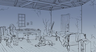
Whoohoo! Gradients!
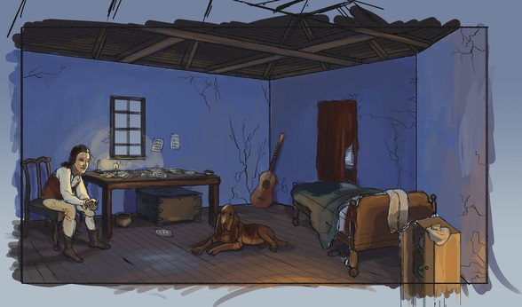
| Next, I fill in the flat colors for the different planes (walls, ceiling, floor). I use a high opacity brush and only lightly pay attention to lighting, as this stage comes later. So that I don't get overwhelmed by lighting, shadow, local color and color scheme, it really helps to break it down into simple steps to keep everything cohesive. |
Planes of color.
| After that, I fill in local color. (The color of something as perceived to be in daylight, uninfluenced by other sources). Now, local color changes with different lighting, so it's important that something that is red in daylight, still looks red in a dimly lit room. They will be far from the same color though. If it's hard to visualize what the color should look like, it helps to start with the daylight color, and adjust it from there. It's important that you choose the color from the color wheel, and not just paint over the local color with blue or another color to "mix" it. Photoshop is not oil paint, it doesn't mix well. --> In this chart I showed what the daylight colors would look like for three of the hues in my painting. | 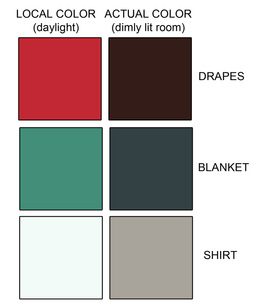
|
Local Color.
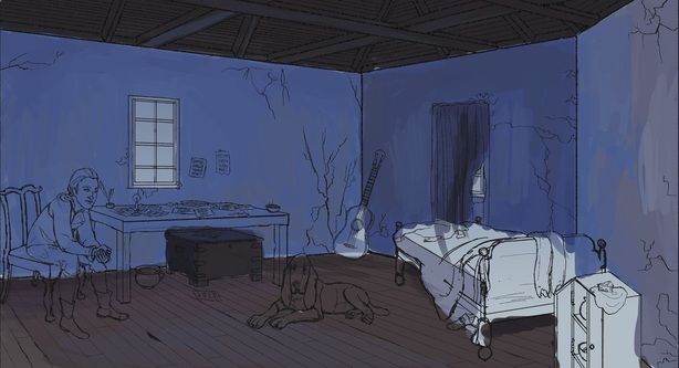
Then I paint the sources of light, and the highlights that go with that. For this, I knew there would be a single candle lit on the table, a fire lit out of frame on the bottom right, and some light filtering in from the window.
Highlights and sources of light.
Lastly, I paint in the shadows. And that's it! I try to work in a bigger canvas than the picture frame, so that the painting stays loose and natural. It's easier to draw through and paint through this way. I usually only crop it for the final image (although I cropped the other versions for this post).
Shadows!
My color studies are usually fairly complete. Final color adjustments come at the end, but figuring out all the color and light play helps the final painting to go a lot faster and smoother.
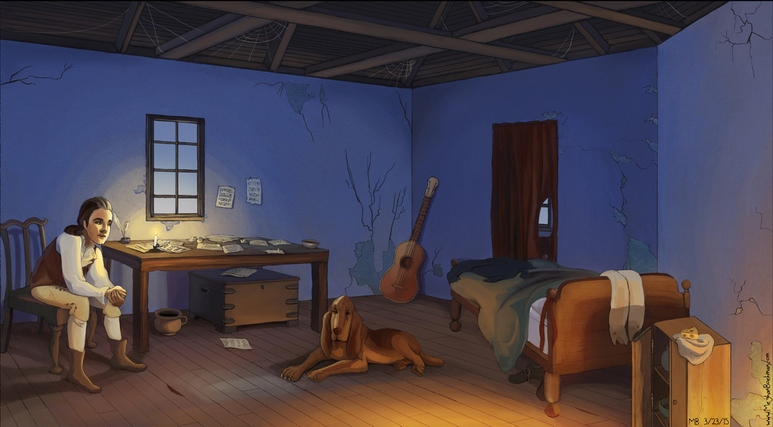
My final piece.
 RSS Feed
Meghan Boehman Art
Art tips I learn and helpful resources that I find.
Archives
April 2016
November 2015
October 2015
August 2015
July 2015
June 2015
May 2015
April 2015
March 2015
February 2015
January 2015
December 2014
November 2014
