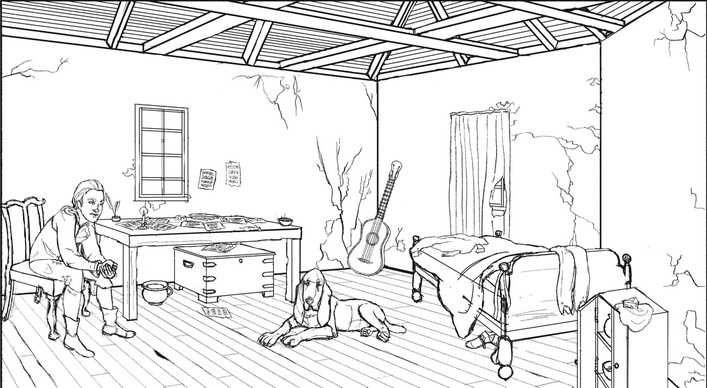
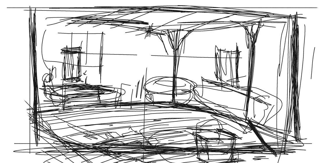
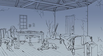
My line drawing is usually as close to final as I can get, with only a few construction lines remaining. It's important to fully visualize this before entering the coloring stage.
After I finish the line drawing (expect a future blog post discussing my process for draftsmanship), I fill the canvas with a gradient with the basic colors that I want for the scene. In this case, I knew outside was going to be dusk, so I made the gradient closer to the correct color for outside. The gradient helps me to see past the blank canvas and to better realize the color palette.
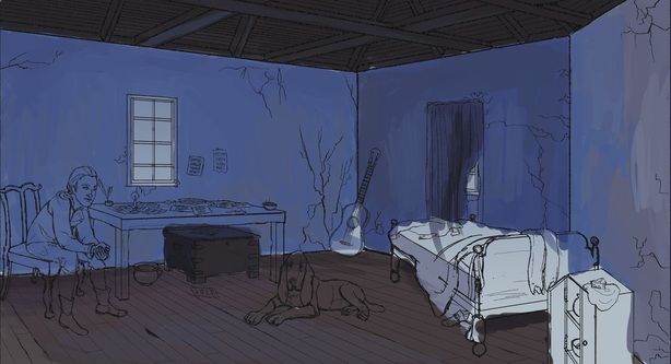
Planes of color.
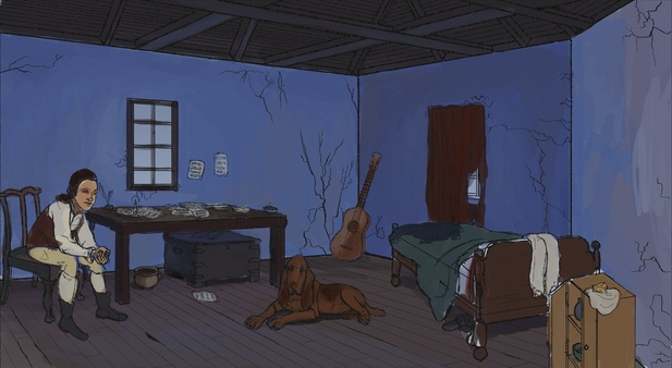
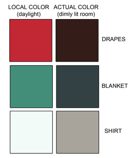
Local Color.
Then I paint the sources of light, and the highlights that go with that. For this, I knew there would be a single candle lit on the table, a fire lit out of frame on the bottom right, and some light filtering in from the window. 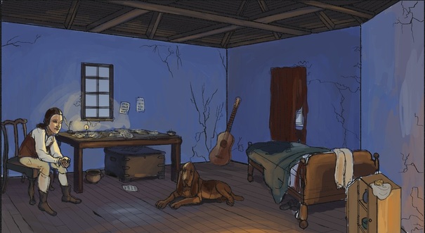
Highlights and sources of light.
Lastly, I paint in the shadows. And that's it! I try to work in a bigger canvas than the picture frame, so that the painting stays loose and natural. It's easier to draw through and paint through this way. I usually only crop it for the final image (although I cropped the other versions for this post). 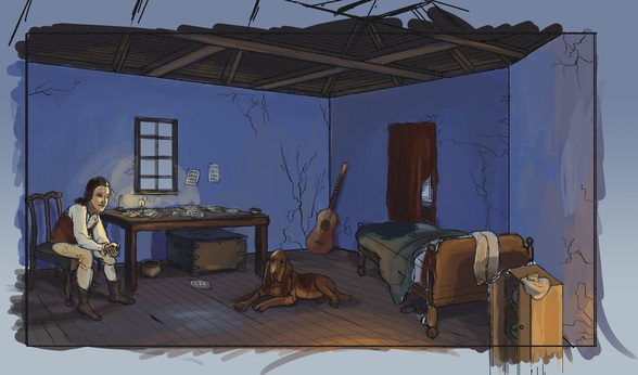
Shadows!
My color studies are usually fairly complete. Final color adjustments come at the end, but figuring out all the color and light play helps the final painting to go a lot faster and smoother. 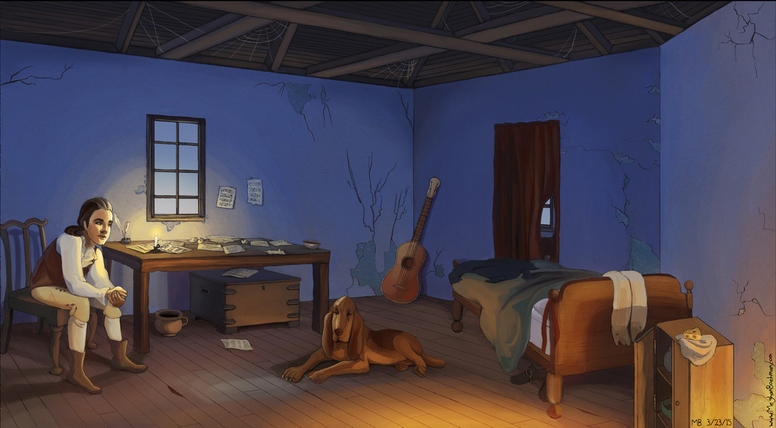
My final piece.
0 Comments
Leave a Reply. |
Meghan Boehman Art
Art tips I learn and helpful resources that I find. Archives
April 2016
|
 RSS Feed
