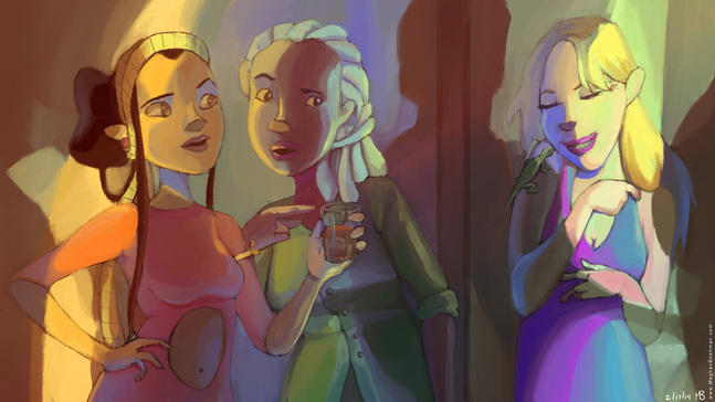
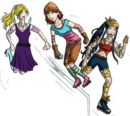
My Roller Derby Gals hanging out at the club.
So many preliminary sketches! It's important to figure things out here, so that your final image doesn't suffer from lack of planning.
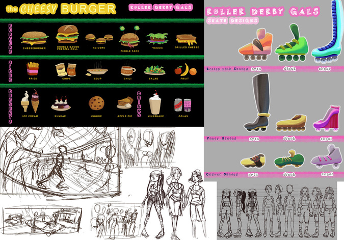
I even went so far as to make formal model sheets and prop sheets to show their different outfits and shoes, and the menu of The Cheesy Burger, the local joint that the Gals frequent. Maybe I did too many sketches, but I think it really helped my final pieces go much more smoothly, so I have no regrets. 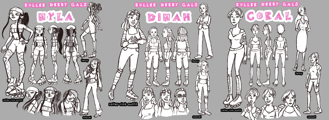
Model sheets for the Gals.
I work predominantly in natural light, so it was very refreshing and exciting to delve into artificial. One thing that is always important, but especially in paintings like these, is to consider where your light is coming from, and where it bounces. Since the sources of man-made lighting are usually much closer to the subject, the bounce factor is greater. Pay attention to parallel and perpendicular surfaces, they reflect the same light differently. It helps to do studies from life. If you don't have a model on hand, grab a mirror and a light, and get to work on self portrait studies. That's what I did! 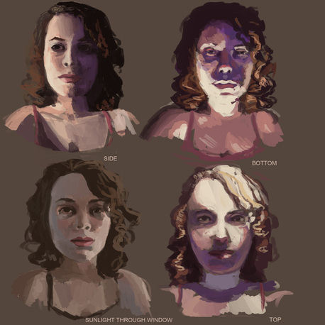
My self portrait lighting studies. Each took about 15 minutes.
For my club scene, I knew shadows would be an important element, so I made sure to sketch out the forms they came from in order to accurately depict them. Even if you stray from your sketch, at least the foundation makes sense. You can only go up from there. 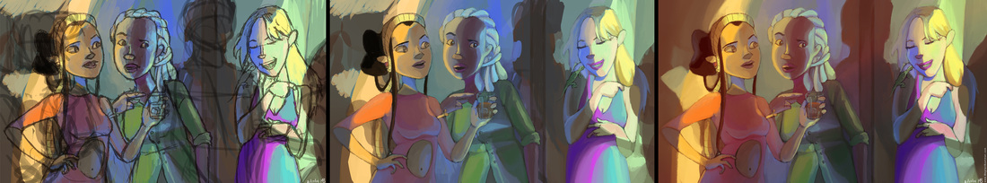
The process for my club scene. I turned on the "scattering" option on the Photoshop brush presets for these pieces and found it to blend easier.
After doing finalized line work, I did a fairly final color study, figuring out the local colors, shadows and bounce light. For me, it is very easy to muddy local color (the natural color of a thing as perceived in daylight i.e. red apple) by painting opaque highlights and shadows on top; it is very important to consciously select the local color and think through what is affecting it before settling. After finalizing all the painted elements, I added a layer of blurred glows, an opaque layer of additional shadow set to "Multiply" and a gradient overlay going from orange to indigo set to "Vivid Light" and brought down to about 20% opacity. I find these really help to unify the image into a completed piece. 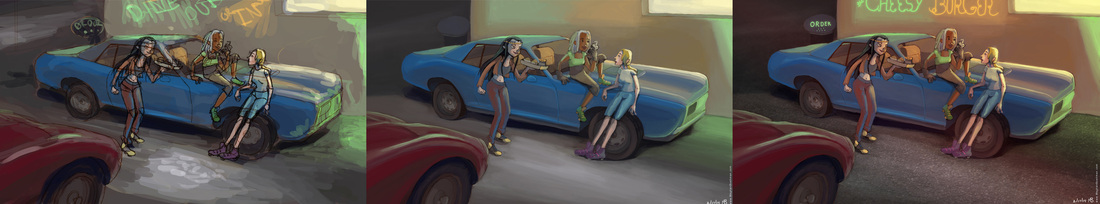
The process for my diner piece.
The process for my diner painting was very similar, although I hid a few photo textures in this one. Overall, I think I succeeded in my studies of neon lights, and more to my surprise, I bettered my local color, a demon I have battled for a long time. 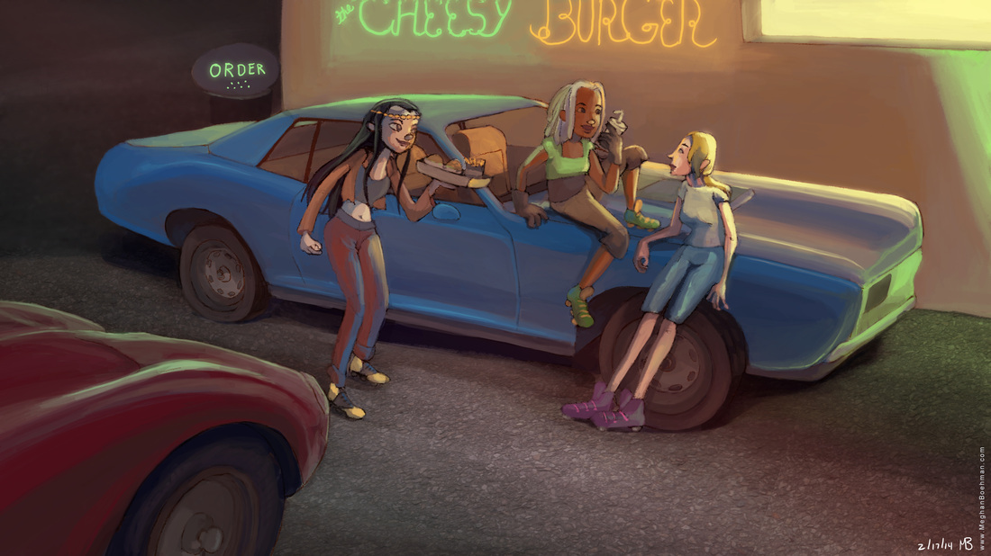
The final diner.
0 Comments
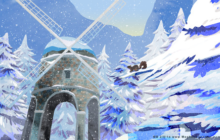
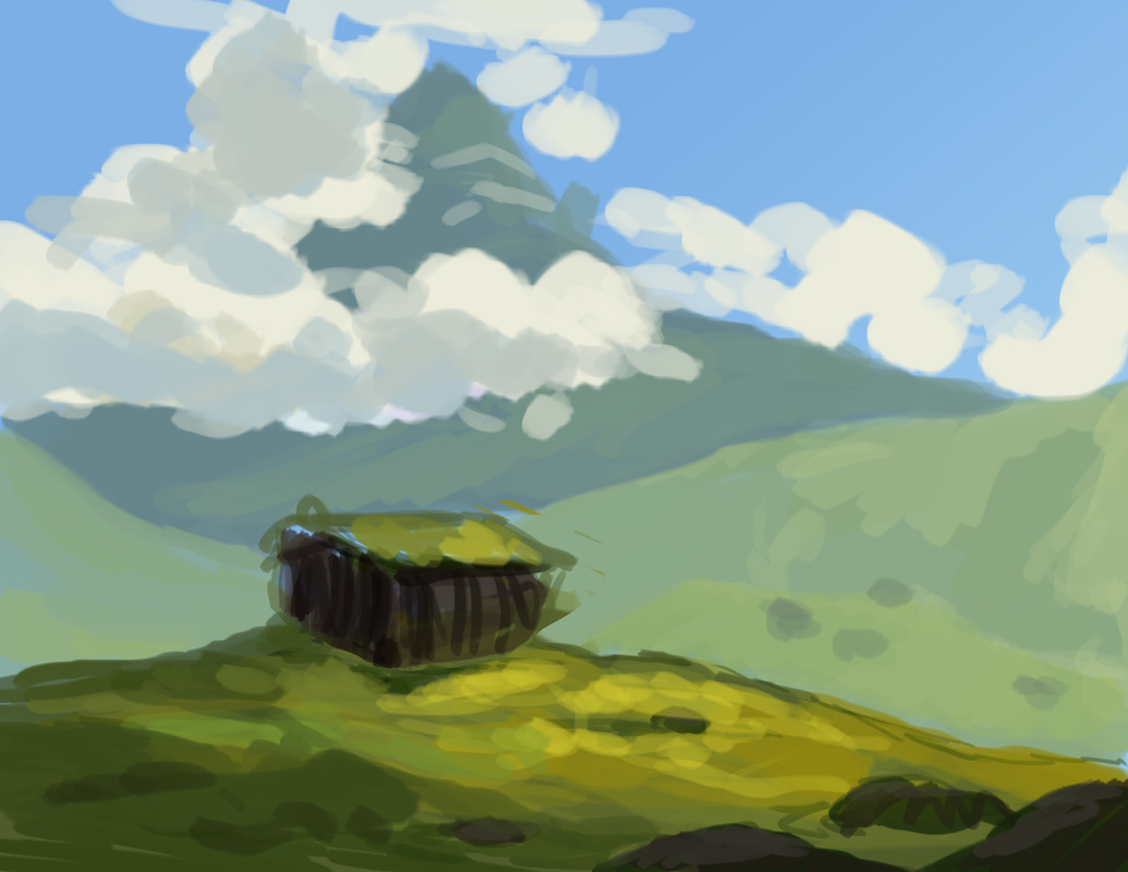
My winter scene in the lasso/gradient style.
While I was in animation school I did a lot of background art for my fellow classmate's films. One project had over 60 backgrounds, so I created a simple efficient graphic style that looks good. It works best for organic backgrounds set in nature, but you can manipulate it however. I've done 3 pieces for 3 different seasons to showcase this style, and so I can talk about my process. I painted this chunk of grass to easily show my steps: 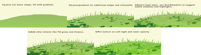
Blocking out good silhouettes is important (for anything but especially graphic styles). I usually start with a sketch, but this time I selected my shape with the lasso tool, picked two green colors, varying slightly in hue, and filled it. I made a new layer, selected different shapes for leaves and separate grass stalks, and filled those with another gradient. Next I go back to the base layer, select areas for shadow, open up Hue/Saturation and darken and saturate it. I do the same for highlights, expect I make it lighter and more yellow. Then I added some more details on top. I duplicated my grass and put some in the foreground, and filled some tiny circles to imply flowers. Last, I took a photo texture of a leaf, cut it out around my elements, and set the layer to "Soft Light", lowering the opacity as desired. (An easy way to select the layer is to press command+click on the tiny box on the layer palette, click shift to add selections to additional layers.) I like to select textures that go with the subject of what I'm painting, but that aren't necessarily a normal texture. For instance, I put spring flowers on tree trunks if the scene takes place in springtime. 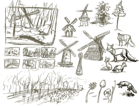
My preliminary sketches for Winter and Spring.
If I'm painting an actual scene, I start with preliminary sketches to figure out composition and and subjects. I'll usually make a fairly final sketch and then do either a gray scale or a color study before I get to the lasso tool. 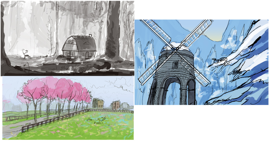
Sketches and color studies. Colors are usually very close to final.
Once I start blocking it out, I fill all the basic shapes with gradients before I start with detailing, shadows and highlights. This helps me to visualize the scene and see if the composition is working without getting distracted with pretty textures and colors. 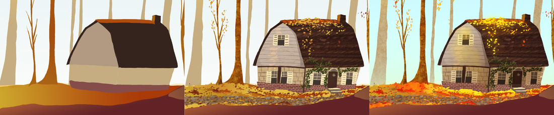
Blocking --> Lasso detailing --> Texture overlays
The nice thing about this style is it can go from looking pretty plain at the blocking stage, to having a lot of visual "tooth" as my artist friend Rachael Briner likes to say. 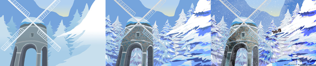
The texture (far right panel) can make it look pretty, but without good blocking and shadows and highlights, it's not going to add anything.
I hope this process was informative and not too self explanatory. Email me if you have any questions or need clarification on this process or anything else I've done. I am happy to help. 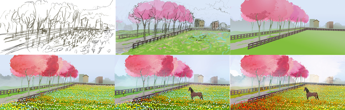
Spring!
RESOURCES I LIKE
-My sister Jessica Boehman has a cool blog for cool art things: http://www.hansmyhedgehog.com/blog -Chris Oatley has a blog for new artists featuring a lot of great resources: http://chrisoatley.com/ 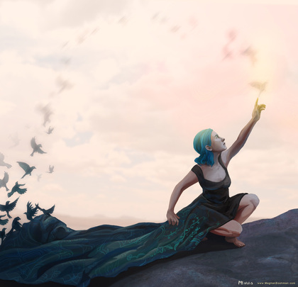
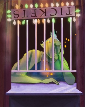
BIRDS!
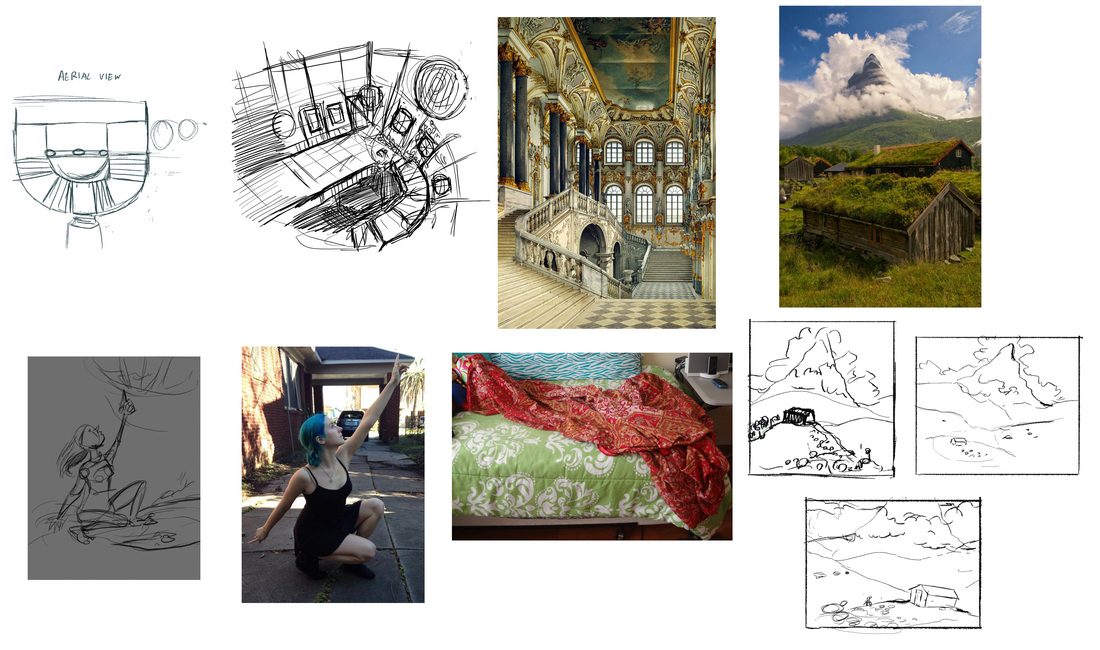
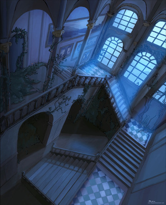
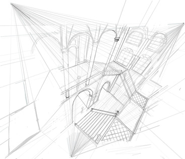
My references and early sketches. Top left are aerial view, inspiration sketch and reference for my interior palace. Bottom row to the left are first sketch and references for my figure piece. Right side are sketches and reference for my landscape.
2. Don't rely too heavily on reference and think outside your own box. Often I've found that reference will slowly contain my work within boring boundaries. It needs to be just that, reference, not something to inhibit your process. Early sketches will sometimes also inhibit my piece from developing. In the back of my mind I assume I've reached the best idea, instead of constantly looking for ways to enhance the work. A lot of best ideas can come very late in the game if you let them.
3.) Don't be afraid to redraw to establish energy. It doesn't matter how late you are in the process, if something is stiff and lacking energy, fix it. You'll feel better and the fixes will go faster than you think. Drawing my figure from reference made her a lot more stiff than I would have liked. After I had finished painting the body, I redid the arms and part of the face. I think it could still use some more energy, I need to put some more of my animation into my still images. 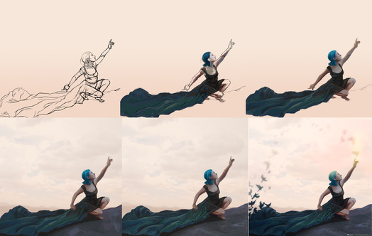
Progress for the figure. The bottom row shows the redrawn arms. The birds came rather late in the process as well.
4.) Areas in shadow have less detail. If you utilize any photo textures, make sure to erase out most of the texture in shadowed areas. It's easier to paint this way, and looks more realistic. If the human eye can't pick up texture in low light, why should a painting? 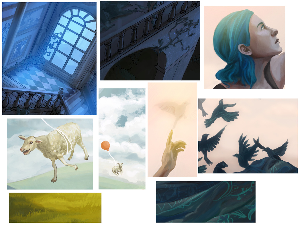
Some details.
5.) Vary your brush size. Blocking out with a large brush can be very beneficial to getting colors to blend naturally, but for the final details you'll always want to switch to a small brush. People ultimately want to know what brush settings famous artists use, but it's most important that you have a variety, that they don't distract and that the colors look good. A lot can be forgiven with good colors. 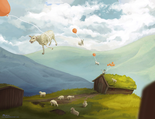
Only the final version contained flying sheep. I asked my roommate what was missing (I referred to the rendering), and she said flying sheep. She was right!
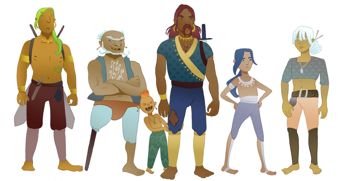
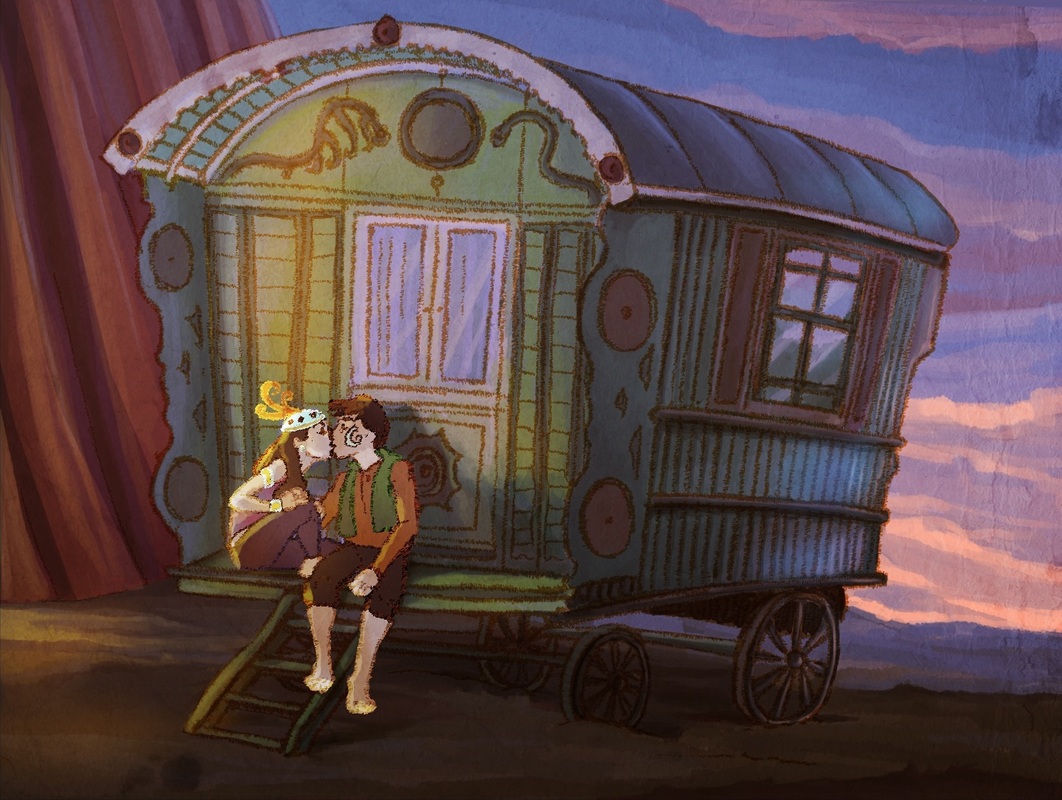
My "new" gypsies. I just realized the young boy second from the right, bears a striking resemblance to "Rayek" from "Elfquest".
One of my favorite things to do is redraw my old pictures. I'm the type of artist where it's really hard for me to see my own art as unique or skillful. It helps me when I redo something because then I have a direct comparison to show me what I've improved upon. But MY GOODNESS, I could not draw before. 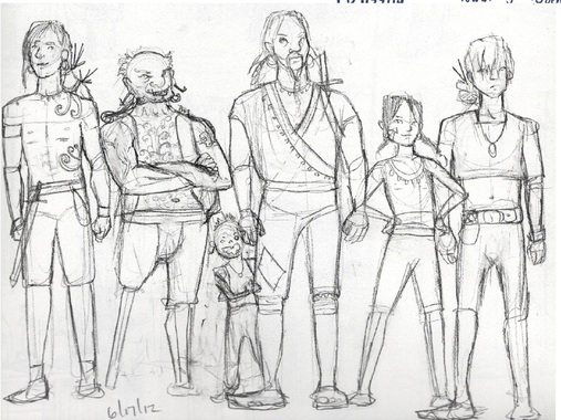
The "old" gypsies. SO SCARY.
I drew these gypsies only two and a half years ago, yet it seems like a lifetime worth of art improvement. Why did I ever think these were good? Often times, in day to day work, I can't see improvements and it frustrates me. I know I need to be better, and I work hard at it, but it doesn't seem to be there. But, improvements are small. They aren't visible daily, but when you look back across the years or months, it's more clear. 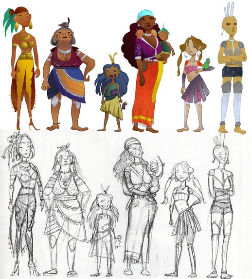
Originally my aim was to draw a young attractive woman, an old woman, a bratty little girl, a mother, a preteen girl, and an outcast girl or the "black sheep". After I would draw their male counterparts. I think I initially succeeded at pushing the diversity of my design for my skills at the time, although anatomy and diversity of silhouette were definitely lacking. Here's an in-depth analysis of two of my favorites. 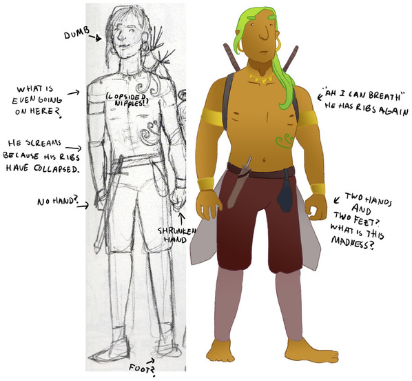
This young man was my least favorite in the old one, and my favorite in the new. Before he seemed bland and generic. For the new one I pushed the shapes, elongating the head, creating distance between the nose and mouth, and corrected anatomy. I don't know why I didn't draw hands and feet before. Probably because they were annoying. But not as annoying as looking back and realizing my characters had nubs for appendages. This brings me to the old woman. 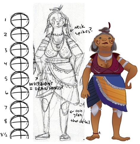
Old age really shrunk her down.
I just need to point out one thing. She was 8 1/2 heads tall. GREEK ADONIS' WERE NOT THAT TALL. I chopped off a few heads for the new one. I think she turned out better this time. 
THE HORROR.
*Sigh of relief. I did improve. My current art is far from perfect. I can see the errors in weight, anatomy and diversity. But my brain isn't quite able to realize them yet. But for today, I can put frustration aside, knowing I improved since last time I drew these gypsies. I'm excited for the next two and a half years, perhaps I'll look back at my new gypsies and scream with horror then. I can't wait! 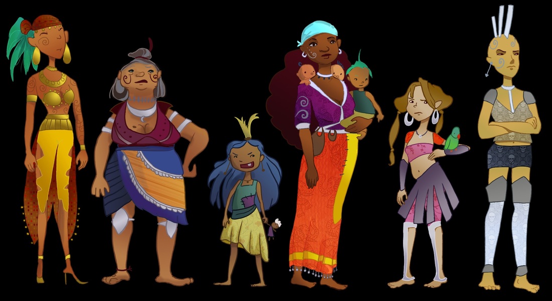
Color makes everything better.
In the wake of the terrorist attacks on Charlie Hebdo in France this month, I think it is important for all of us to remember the powerful impact that art has on those around us. Everyone can recall a time when a film, drawing, book or play affected us. Perhaps it evoked a raw sense of emotion and animal instinct. 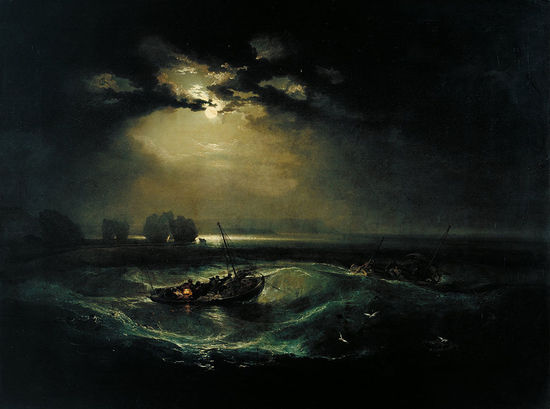
JMW Turner's "Fishermen at Sea" 1796
Or maybe it stirred a nostalgic feeling for something we did not know we missed. 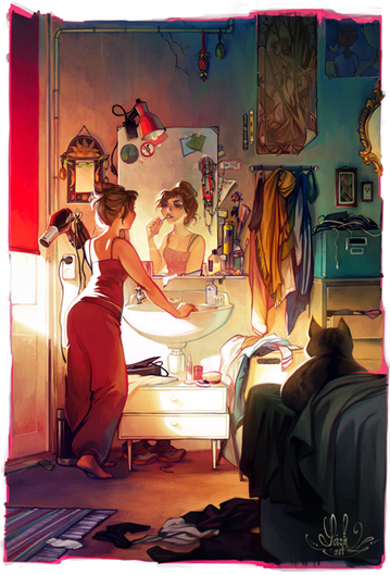
Artwork by Lois Van Baarle aka "Loish". http://loish.net/
Or maybe it reminded us of an old friend and made us laugh. 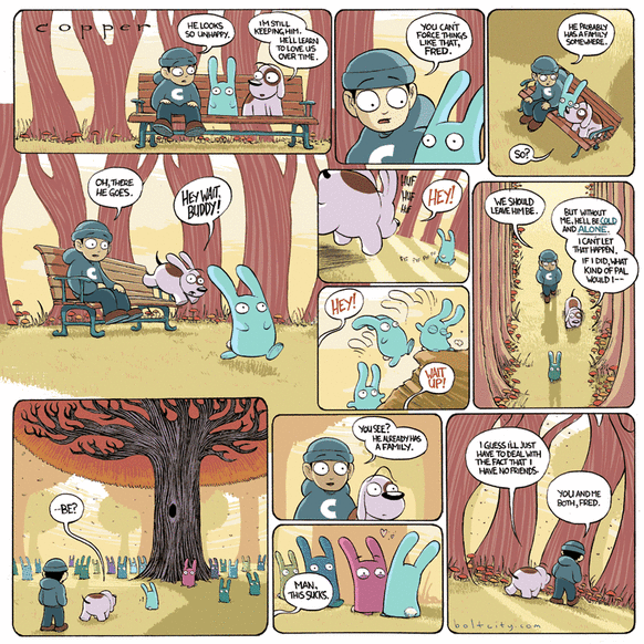
"Copper" by Kazu Kibuishi. http://www.boltcity.com/copper/
Regardless of the effect, each of us, especially artists, has a responsibility to watch out for our fellow man, and perhaps even to try and help others with our work. The tragedy at Charlie Hebdo reminds us that free speech is an important aspect for society, but even more importantly, it reminds us of how fragile humans can be. If each of us remembered every day that every person we meet is loved by someone, and loves someone in return, perhaps it would make the differences between us seem far less insurmountable. 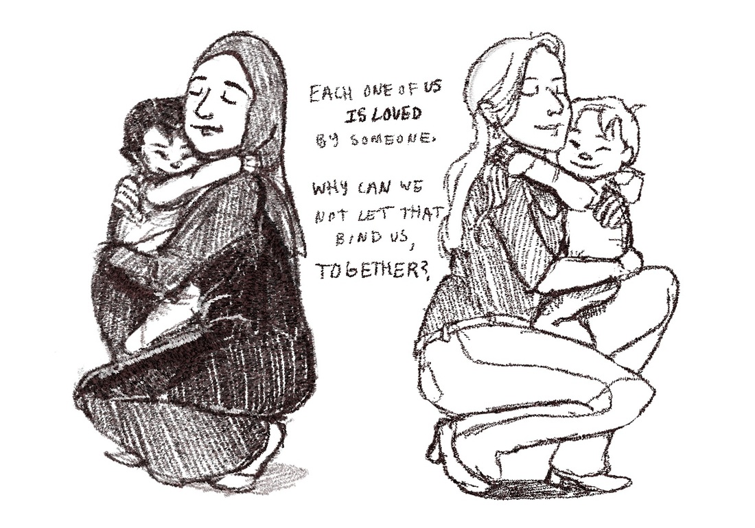
(Sketch by me)
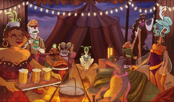
The first of my 3 carnie pictures. This one shows a party.
Over the last few weeks, I've had a few very helpful portfolio reviews. The general consensus was my style deviations were nice, but I should do more of each. I decided that each time I do a new painting, I'll do three of them, in the same style and world. I first heard of this technique from master concept artist Feng Zhu. When he works on a piece, he simply divides his canvas into three parts and jumps from one to the other in order to increase his productivity. 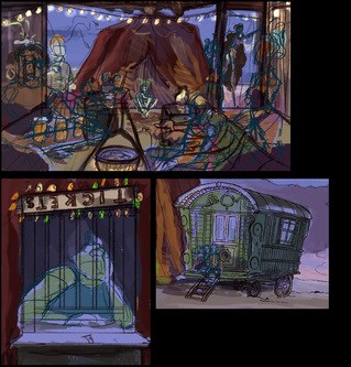
A view of my canvas after I had finished rough line work and a color study for each piece.
I used a fantastic pencil brush on Photoshop created by Andantonius on Deviant Art. I've found most success using this brush with a dark color, a small size and the pencil tool instead of the brush tool. After doing the color studies, I finalized the line work for all the characters with a dark brown pencil tool. I then selected areas with the lasso tool to fill with a gradient based on the colors from my studies. I colored my lines next, command clicking on the line layer to select only the lines, and then repainting them with colors analogous to their fills. Next I filled in highlights and shadow using a few different layer styles, mainly overlay, color dodge and hard light. I selected the fills for the characters and blurred the highlights inside of them, so they would be soft but still have a hard edge on the outline. I also applied some photo texture patterns to the character's clothing. 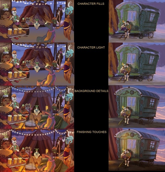
As you can see, I didn't add much to the far right picture for "character light", it was hard to work on all pieces evenly at the same time.
After the characters were completed, I moved onto the background, filling in the remaining details. I applied a similar technique for highlights as I did for the characters, but only added one or two textures. For my finishing touches, I added final glows and shadows created by the different sources of light. In the party scene, I added a dark gradient to the background to separate it from the characters. For each piece, I added an overlay of texture on the whole image, as well as a gradient fill adjustment layer to unify and adjust the color. 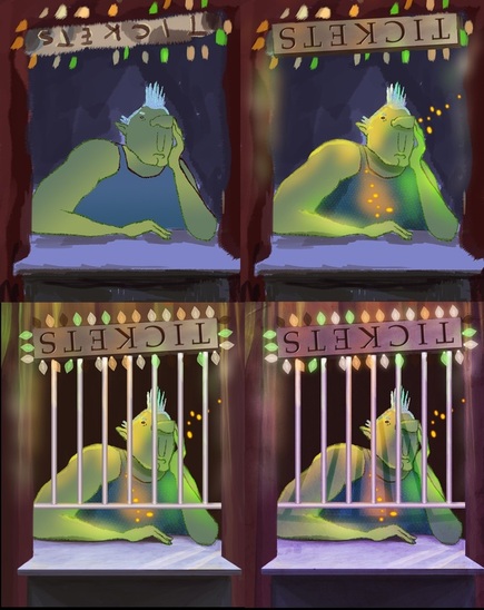
I had a lot of fun with the three different colors of light reflecting off of this character.
I'll definitely have to get used to this technique. It worked out really well for the beginning stages of the paintings, but as I progressed, I only wanted to finish one at a time. Maybe next time, I'll figure out a better balance. Resources: Make sure to check out Feng Zhu's work, he also has some great video tutorials that you can find here. Another always great resource is traditional painter James Gurney. I learned most everything I know about realism from his incredible book, Color and Light. Seriously, buy it, it's worth more than four years in art school. He also has an informative blog that he updates regularly.
"A bird doesn't sing because it has an answer, it sings because it has a song" -Maya Angelou The weekend started out with an inspiring keynote speech from legendary animator Glen Keane. He told us that we tell a little part of our own story when we draw something, and we cannot help it. Only if we avoid our inner voice does our work come out unoriginal and bad. In closing he revealed that he still thinks that any day now someone is going to out him and say "Hey! You're not actually an artist". Every artist can attest to this, we are all faking it (or we feel that we are) and hope no one catches on. Many talented artists held workshops and we were lucky enough to see more than a few of them. My favorite pieces of advice from this weekend: director Genndy Tartakovsky (Dexter's Lab, Samurai Jack, Hotel Transylvania), speaking about creating Samurai Jack, said that not everything can be an 'A', you have to make a conscious decision to have 'A', 'B' and 'C' shows (or painting, animations, etc) because you cannot put 100% in everything, so therefore you know you will always have something good; concept artist Ian McQue (Rockstar) said "If you don't show your work to anybody, it doesn't exist"; and designer Joe Bluhm (Moonbot Studios) told us that he can draw anything that he can take apart and put back together. At the end of the first day of the convention, my roommate and I did some gesture drawing. Live models could be found at any point of any day, with a herd of artists sketching away.  A quick drawing I made based on one of my gesture sketches. My favorite booth there was one for an upcoming short film called "The Ottoman". It's a 3D film with a beautiful 2D aesthetic about what the world would be like if the Ottoman empire still existed today. The team is both passionate and talented. They are currently kickstarting right now (they have some great rewards too). Check out their kickstarter here: https://www.kickstarter.com/projects/1027198543/the-ottoman-animated-short-film 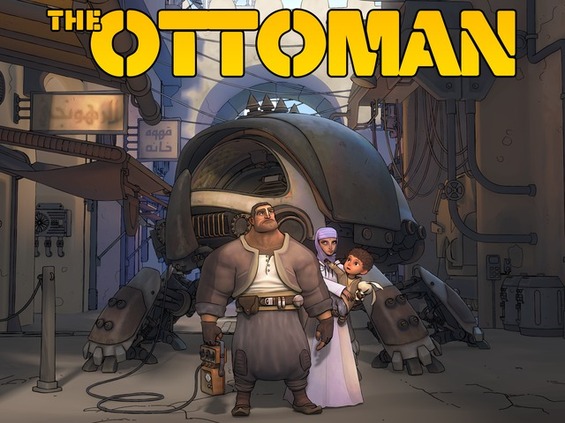 A film by Luckbat studios and director Mike Stamm. I know I'm funding it! https://www.kickstarter.com/projects/1027198543/the-ottoman-animated-short-film We were fortunate enough to receive many helpful portfolio reviews from concept artist Piero at Firaxis Games, Nickelodeon, concept artist Jason Scheier and Powerhouse Animation. All of which gave great advice and have inspired us to make so much more art. 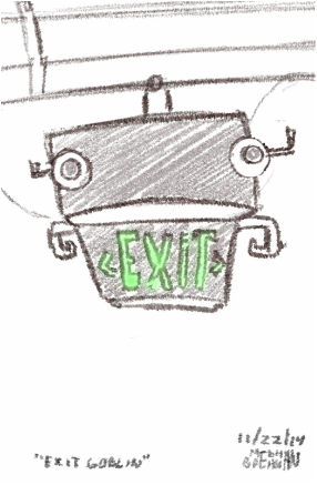 While standing in line, I noticed that Exit signs look like goblins. Thus I doodled the "Exit Goblin". In closing, CTN animation expo was a great experience. I think it's most valuable for recent grads and students, but nonetheless there is something for everyone there. I'm glad I went, now back to work!
I just started a Tumblr, check it out here: http://meghanboehman.tumblr.com/ And here are some great resources suggested to me at CTN: Neil Campbell Ross Alberto Mielgo Sam Deats Lynne Naylor |
Meghan Boehman Art
Art tips I learn and helpful resources that I find. Archives
April 2016
|
 RSS Feed
