|
Color is hard. And nighttime color is even harder, because your options are seemingly more limited to cool colors. I'm going to talk about how I learned how to improve my color through nighttime scenes, and hopefully somebody can glean insight from it. 1.) Rookie Mistakes- Too many colors. 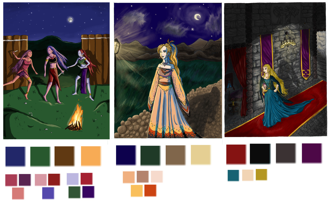 These pictures are SO OLD. Above are some of my really old paintings from about 10 years ago. You can see by the color samplings from the paintings, that I didn't really have any grasp on color except for a rudimentary understanding of local colors. There are too many colors, and they are too saturated for nighttime. It's important to have an idea of the overall color scheme, especially for nighttime because it is so limited. Usually nighttime colors are de-saturated and lean more towards cooler hues. 2.) Don't limit your palette too much. 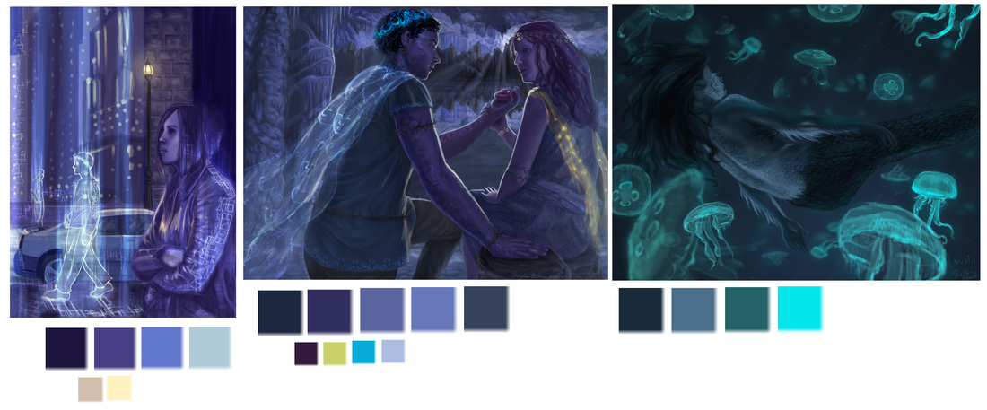 Here are some newer paintings, but still old. You can see that I finally understood that nighttime is blue. However, my palette was not very diverse, mostly shades of the same hue. It looks better, but it's important to try and introduce secondary colors to liven up the scene. Something else important is to pick the dominant hue that you want nighttime to be. You can almost get away with any color, as long as it is dark enough and the lighting is correct for night. The painting on the right of this set is newer than the others, you can tell because I introduced cyan into the mix, instead of the same shades of indigo that I would previously default to. 3.) Focus your color palette. 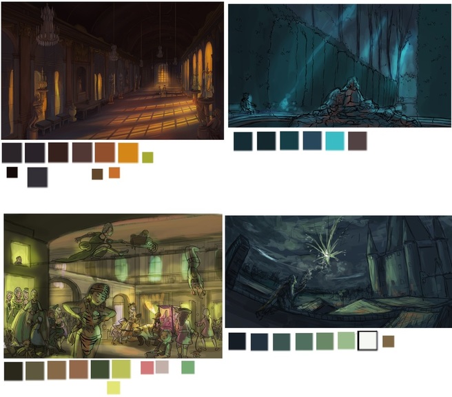 A few of these are color studies and not the final pieces, because your color should mostly be figured out in this stage. As you can see from the last set above, the color schemes are very different from one to the next. It's easy to begin by choosing your main color (i.e. cyan, indigo, purple) and then deciding on your accent colors. Accent colors can be from a specific light source, or small smudges of hues to complement the main color. You can see how I did this in the right two paintings. On the top right, I put a red light on the front statue, although the color appears more brown when sampled by itself. And on the bottom right I put a small bit of orange on the front rooftops. If you're having trouble with colors, look up famous artist's paintings, or an artist you admire and try to recreate that color scheme yourself.
0 Comments
|
Meghan Boehman Art
Art tips I learn and helpful resources that I find. Archives
April 2016
|
 RSS Feed
