
My winter scene in the lasso/gradient style.
While I was in animation school I did a lot of background art for my fellow classmate's films. One project had over 60 backgrounds, so I created a simple efficient graphic style that looks good. It works best for organic backgrounds set in nature, but you can manipulate it however. I've done 3 pieces for 3 different seasons to showcase this style, and so I can talk about my process. I painted this chunk of grass to easily show my steps: 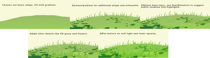
Blocking out good silhouettes is important (for anything but especially graphic styles). I usually start with a sketch, but this time I selected my shape with the lasso tool, picked two green colors, varying slightly in hue, and filled it. I made a new layer, selected different shapes for leaves and separate grass stalks, and filled those with another gradient. Next I go back to the base layer, select areas for shadow, open up Hue/Saturation and darken and saturate it. I do the same for highlights, expect I make it lighter and more yellow. Then I added some more details on top. I duplicated my grass and put some in the foreground, and filled some tiny circles to imply flowers. Last, I took a photo texture of a leaf, cut it out around my elements, and set the layer to "Soft Light", lowering the opacity as desired. (An easy way to select the layer is to press command+click on the tiny box on the layer palette, click shift to add selections to additional layers.) I like to select textures that go with the subject of what I'm painting, but that aren't necessarily a normal texture. For instance, I put spring flowers on tree trunks if the scene takes place in springtime. 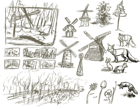
My preliminary sketches for Winter and Spring.
If I'm painting an actual scene, I start with preliminary sketches to figure out composition and and subjects. I'll usually make a fairly final sketch and then do either a gray scale or a color study before I get to the lasso tool. 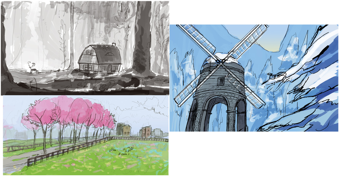
Sketches and color studies. Colors are usually very close to final.
Once I start blocking it out, I fill all the basic shapes with gradients before I start with detailing, shadows and highlights. This helps me to visualize the scene and see if the composition is working without getting distracted with pretty textures and colors. 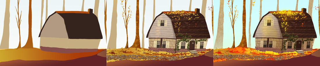
Blocking --> Lasso detailing --> Texture overlays
The nice thing about this style is it can go from looking pretty plain at the blocking stage, to having a lot of visual "tooth" as my artist friend Rachael Briner likes to say. 
The texture (far right panel) can make it look pretty, but without good blocking and shadows and highlights, it's not going to add anything.
I hope this process was informative and not too self explanatory. Email me if you have any questions or need clarification on this process or anything else I've done. I am happy to help. 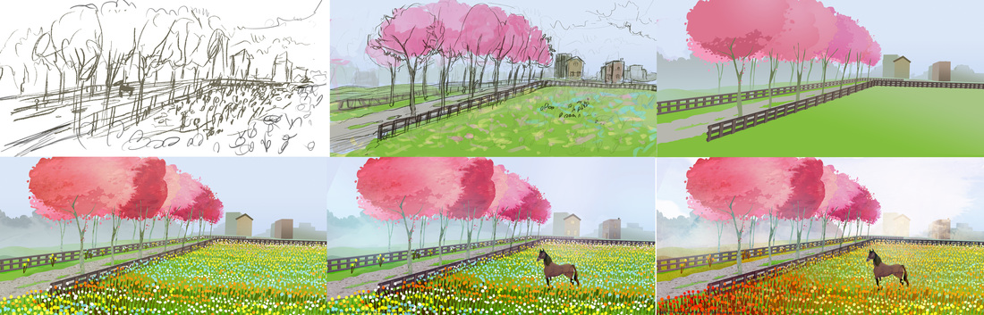
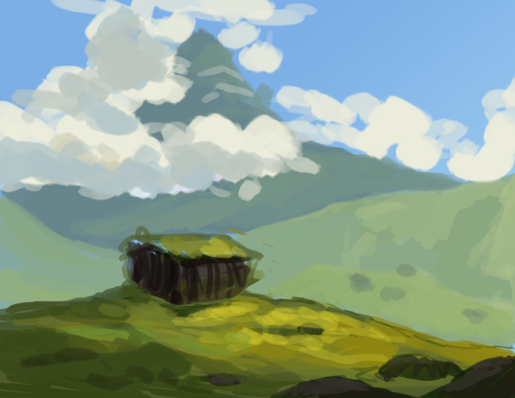
Spring!
RESOURCES I LIKE
-My sister Jessica Boehman has a cool blog for cool art things: http://www.hansmyhedgehog.com/blog -Chris Oatley has a blog for new artists featuring a lot of great resources: http://chrisoatley.com/
1 Comment
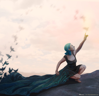
BIRDS!
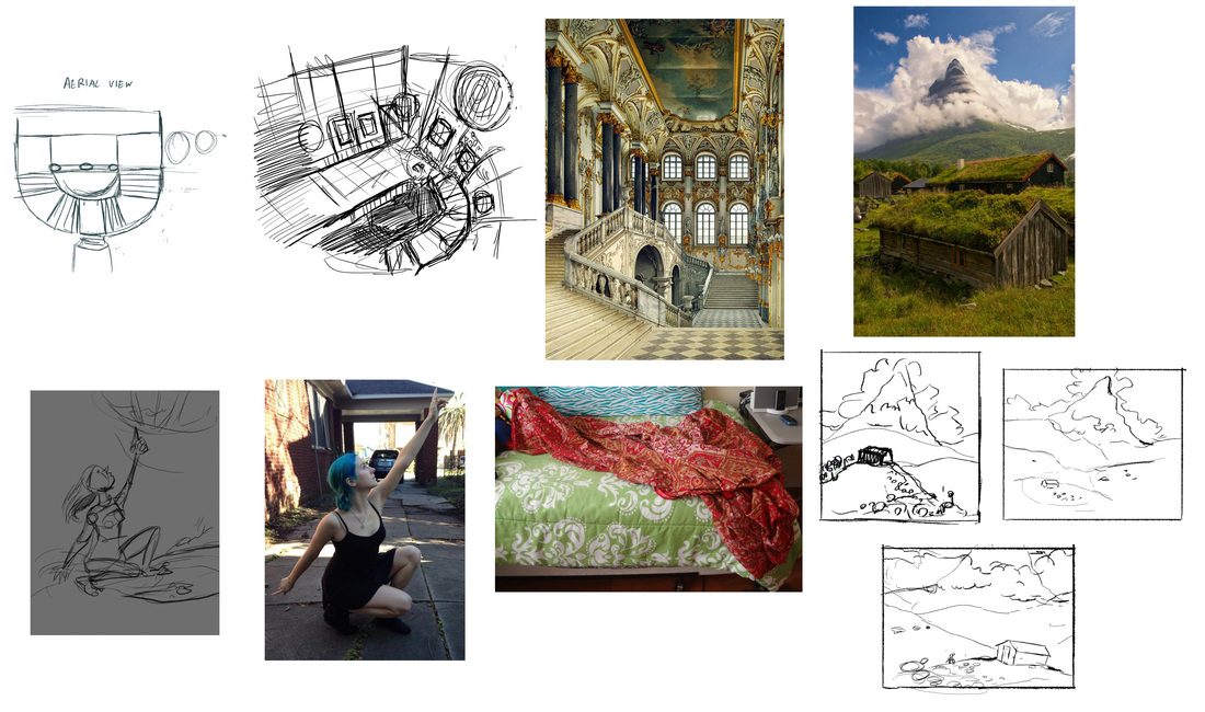
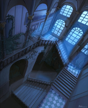
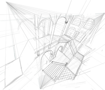
My references and early sketches. Top left are aerial view, inspiration sketch and reference for my interior palace. Bottom row to the left are first sketch and references for my figure piece. Right side are sketches and reference for my landscape.
2. Don't rely too heavily on reference and think outside your own box. Often I've found that reference will slowly contain my work within boring boundaries. It needs to be just that, reference, not something to inhibit your process. Early sketches will sometimes also inhibit my piece from developing. In the back of my mind I assume I've reached the best idea, instead of constantly looking for ways to enhance the work. A lot of best ideas can come very late in the game if you let them.
3.) Don't be afraid to redraw to establish energy. It doesn't matter how late you are in the process, if something is stiff and lacking energy, fix it. You'll feel better and the fixes will go faster than you think. Drawing my figure from reference made her a lot more stiff than I would have liked. After I had finished painting the body, I redid the arms and part of the face. I think it could still use some more energy, I need to put some more of my animation into my still images. 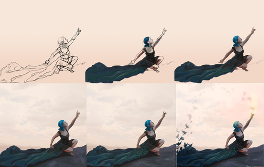
Progress for the figure. The bottom row shows the redrawn arms. The birds came rather late in the process as well.
4.) Areas in shadow have less detail. If you utilize any photo textures, make sure to erase out most of the texture in shadowed areas. It's easier to paint this way, and looks more realistic. If the human eye can't pick up texture in low light, why should a painting? 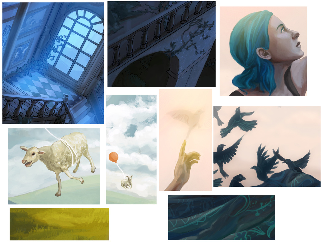
Some details.
5.) Vary your brush size. Blocking out with a large brush can be very beneficial to getting colors to blend naturally, but for the final details you'll always want to switch to a small brush. People ultimately want to know what brush settings famous artists use, but it's most important that you have a variety, that they don't distract and that the colors look good. A lot can be forgiven with good colors. 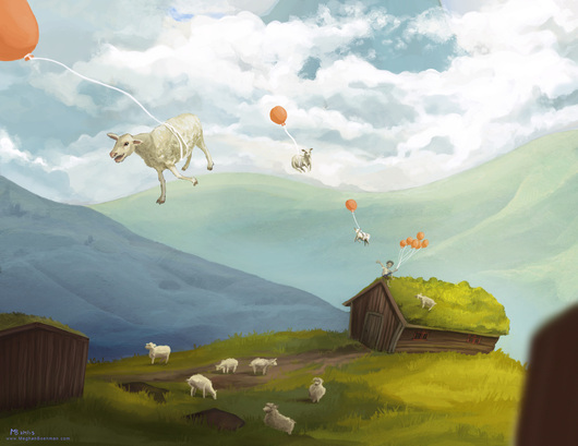
Only the final version contained flying sheep. I asked my roommate what was missing (I referred to the rendering), and she said flying sheep. She was right!
|
Meghan Boehman Art
Art tips I learn and helpful resources that I find. Archives
April 2016
|
 RSS Feed
