
My winter scene in the lasso/gradient style.
While I was in animation school I did a lot of background art for my fellow classmate's films. One project had over 60 backgrounds, so I created a simple efficient graphic style that looks good. It works best for organic backgrounds set in nature, but you can manipulate it however. I've done 3 pieces for 3 different seasons to showcase this style, and so I can talk about my process. I painted this chunk of grass to easily show my steps: 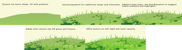
Blocking out good silhouettes is important (for anything but especially graphic styles). I usually start with a sketch, but this time I selected my shape with the lasso tool, picked two green colors, varying slightly in hue, and filled it. I made a new layer, selected different shapes for leaves and separate grass stalks, and filled those with another gradient. Next I go back to the base layer, select areas for shadow, open up Hue/Saturation and darken and saturate it. I do the same for highlights, expect I make it lighter and more yellow. Then I added some more details on top. I duplicated my grass and put some in the foreground, and filled some tiny circles to imply flowers. Last, I took a photo texture of a leaf, cut it out around my elements, and set the layer to "Soft Light", lowering the opacity as desired. (An easy way to select the layer is to press command+click on the tiny box on the layer palette, click shift to add selections to additional layers.) I like to select textures that go with the subject of what I'm painting, but that aren't necessarily a normal texture. For instance, I put spring flowers on tree trunks if the scene takes place in springtime. 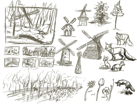
My preliminary sketches for Winter and Spring.
If I'm painting an actual scene, I start with preliminary sketches to figure out composition and and subjects. I'll usually make a fairly final sketch and then do either a gray scale or a color study before I get to the lasso tool. 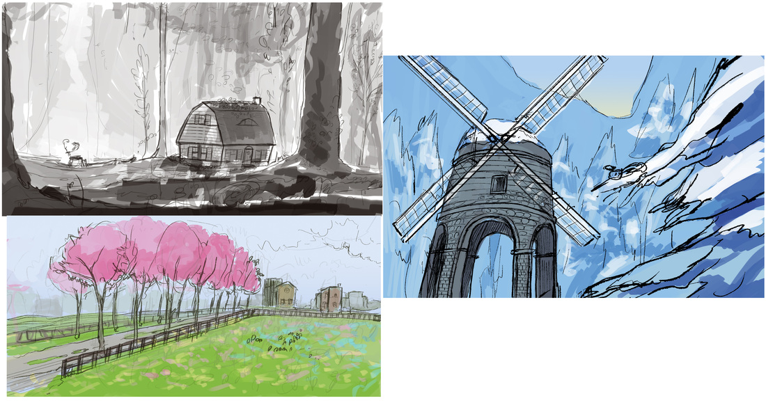
Sketches and color studies. Colors are usually very close to final.
Once I start blocking it out, I fill all the basic shapes with gradients before I start with detailing, shadows and highlights. This helps me to visualize the scene and see if the composition is working without getting distracted with pretty textures and colors. 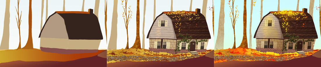
Blocking --> Lasso detailing --> Texture overlays
The nice thing about this style is it can go from looking pretty plain at the blocking stage, to having a lot of visual "tooth" as my artist friend Rachael Briner likes to say. 
The texture (far right panel) can make it look pretty, but without good blocking and shadows and highlights, it's not going to add anything.
I hope this process was informative and not too self explanatory. Email me if you have any questions or need clarification on this process or anything else I've done. I am happy to help. 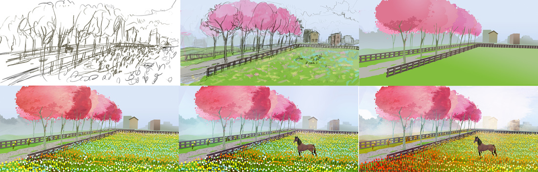
Spring!
RESOURCES I LIKE
-My sister Jessica Boehman has a cool blog for cool art things: http://www.hansmyhedgehog.com/blog -Chris Oatley has a blog for new artists featuring a lot of great resources: http://chrisoatley.com/
1 Comment
|
Meghan Boehman Art
Art tips I learn and helpful resources that I find. Archives
April 2016
|
 RSS Feed
