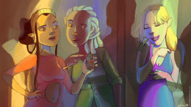
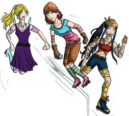
My Roller Derby Gals hanging out at the club.
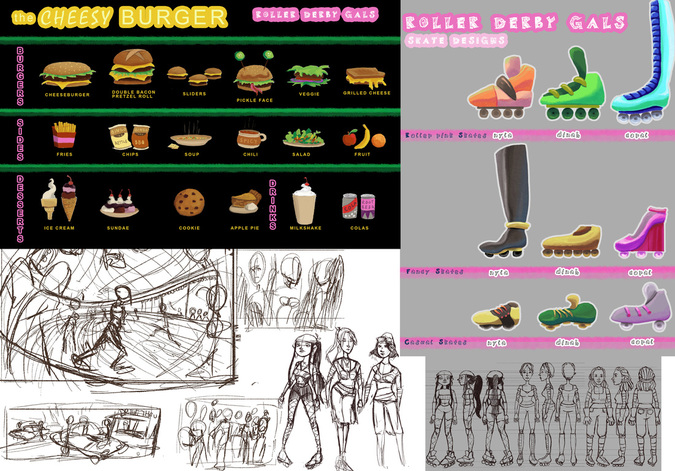
So many preliminary sketches! It's important to figure things out here, so that your final image doesn't suffer from lack of planning.
I even went so far as to make formal model sheets and prop sheets to show their different outfits and shoes, and the menu of The Cheesy Burger, the local joint that the Gals frequent. Maybe I did too many sketches, but I think it really helped my final pieces go much more smoothly, so I have no regrets. 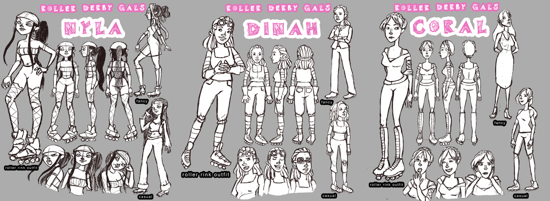
Model sheets for the Gals.
I work predominantly in natural light, so it was very refreshing and exciting to delve into artificial. One thing that is always important, but especially in paintings like these, is to consider where your light is coming from, and where it bounces. Since the sources of man-made lighting are usually much closer to the subject, the bounce factor is greater. Pay attention to parallel and perpendicular surfaces, they reflect the same light differently. It helps to do studies from life. If you don't have a model on hand, grab a mirror and a light, and get to work on self portrait studies. That's what I did! 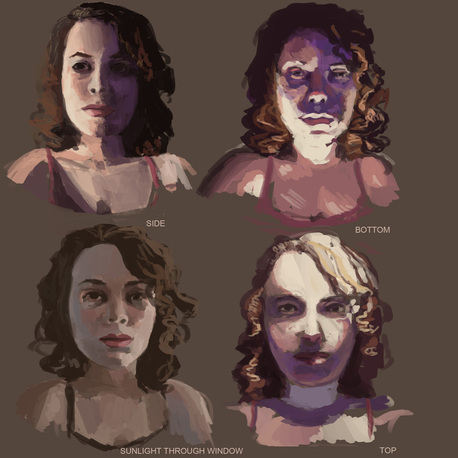
My self portrait lighting studies. Each took about 15 minutes.
For my club scene, I knew shadows would be an important element, so I made sure to sketch out the forms they came from in order to accurately depict them. Even if you stray from your sketch, at least the foundation makes sense. You can only go up from there. 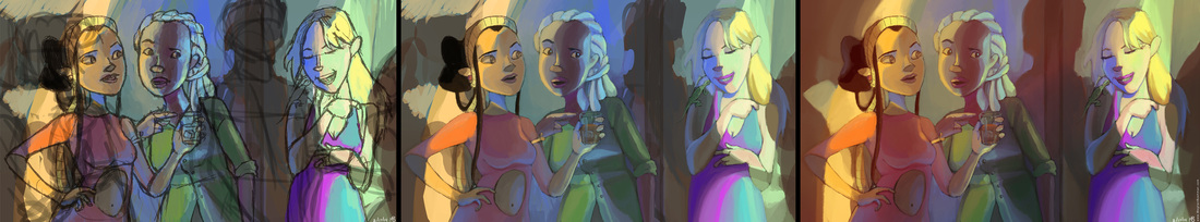
The process for my club scene. I turned on the "scattering" option on the Photoshop brush presets for these pieces and found it to blend easier.
After doing finalized line work, I did a fairly final color study, figuring out the local colors, shadows and bounce light. For me, it is very easy to muddy local color (the natural color of a thing as perceived in daylight i.e. red apple) by painting opaque highlights and shadows on top; it is very important to consciously select the local color and think through what is affecting it before settling. After finalizing all the painted elements, I added a layer of blurred glows, an opaque layer of additional shadow set to "Multiply" and a gradient overlay going from orange to indigo set to "Vivid Light" and brought down to about 20% opacity. I find these really help to unify the image into a completed piece. 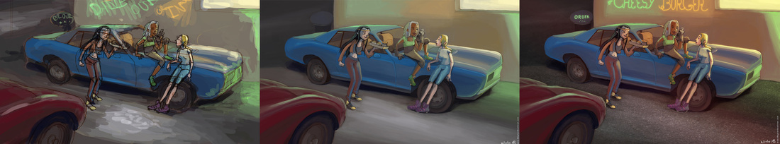
The process for my diner piece.
The process for my diner painting was very similar, although I hid a few photo textures in this one. Overall, I think I succeeded in my studies of neon lights, and more to my surprise, I bettered my local color, a demon I have battled for a long time. 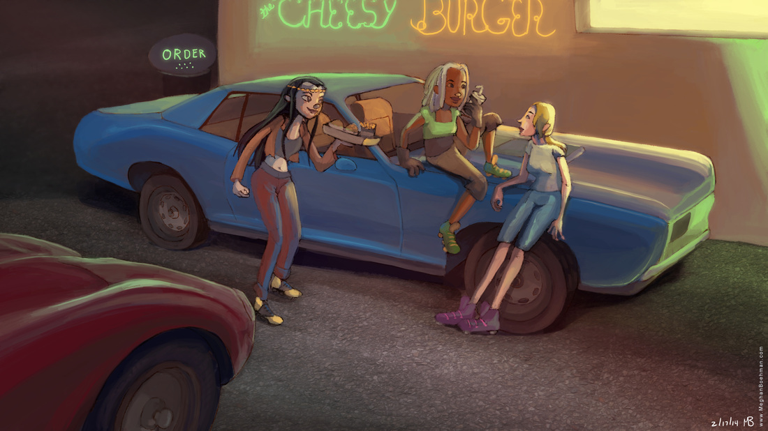
The final diner.
0 Comments
Leave a Reply. |
Meghan Boehman Art
Art tips I learn and helpful resources that I find. Archives
April 2016
|
 RSS Feed
